SELF PORTRAIT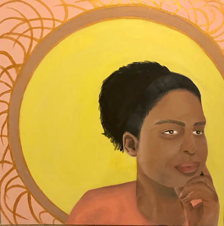
|
Title: Superficial
Size: 91 cm x 91 cm Medium: Acrylic on Canvas Date: October 2017 Exhibition Text
Superficial is a self portrait inspired by the intricacies and symmetry of Art Nouveau and the realistic textures and tones of the Baroque movement. Revolving around the concept of superficial/physical beauty and how it can lead to the instability of self-confidence, emphasis is placed on the face through pale tones and gold circle and geometric lines surrounding it. Through the mixture solid pastel pink and yellow tones, the concept of stereotypical feminine beauty is reinforced. |
PLANNING
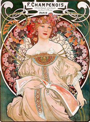
Rêverie by Alfonse Mucha, 1898 |
Inspiration
While searching for artistic inspiration for my self portrait, I was particularly drawn to to Alphonse Mucha’s 19th-20th century Art Nouveau illustrations, paintings, and advertisements. Typically centered around women figures, most of Mucha’s pieces incorporate circles and other geometric shapes and organic lines to add balance and symmetry to the piece. Women were often glorified and emphasized through extravagant clothing and hairstyle, in addition to unified color schemes. Coining the term The Mucha Style, his pieces were praised for their intricate patterns and details, in addition to their incorporation of flowers, leaves, etc. |
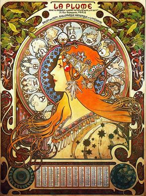
Zodiac by Alfonse Mucha, 1896
|
The Art Nouveau movement was most prominent from 1890-1910 and was not limited to solely paintings and illustrations, but include textile and interior design, jewelry, and furniture. I was particularly drawn to the use of geometric shapes and asymmetrical/organic lines and flowers that when grouped together added symmetry and balance to the piece. Art Nouveau was known for the ‘whiplash’ lines drawn into pieces heavily inspired by botanical studies. I felt that using these particular designs would be most beneficial for a self portrait communicating an obsession with feminine beauty standards and the negative toll they have on self confidence, since I’d be able to communicate a sense of elegance through pastel tones and unified lines and shapes.
In Magritte’s illustration titled La Plume, for example, the whiplash lines can be observed in the hair of the woman; these curved lines gave the piece a sense of beauty and sophistication, and along with the upright and poised position of the woman, communicate feelings of beauty and place emphasis on her physical features. Surrounding the woman are three circles, each with different tones that compliment the color scheme of the overall illustration. Rêverie by Mucha a similar circle surrounding the woman in the illustration, dividing the the background tones of the piece. These circle place emphasis on the woman and allow them to be the centerpiece of the illustration, glorifying their beauty and elegance. Rêverie also uses a similar whiplash lines in the this piece, but instead in the upper corners to incorporate symmetry.
In Magritte’s illustration titled La Plume, for example, the whiplash lines can be observed in the hair of the woman; these curved lines gave the piece a sense of beauty and sophistication, and along with the upright and poised position of the woman, communicate feelings of beauty and place emphasis on her physical features. Surrounding the woman are three circles, each with different tones that compliment the color scheme of the overall illustration. Rêverie by Mucha a similar circle surrounding the woman in the illustration, dividing the the background tones of the piece. These circle place emphasis on the woman and allow them to be the centerpiece of the illustration, glorifying their beauty and elegance. Rêverie also uses a similar whiplash lines in the this piece, but instead in the upper corners to incorporate symmetry.
|
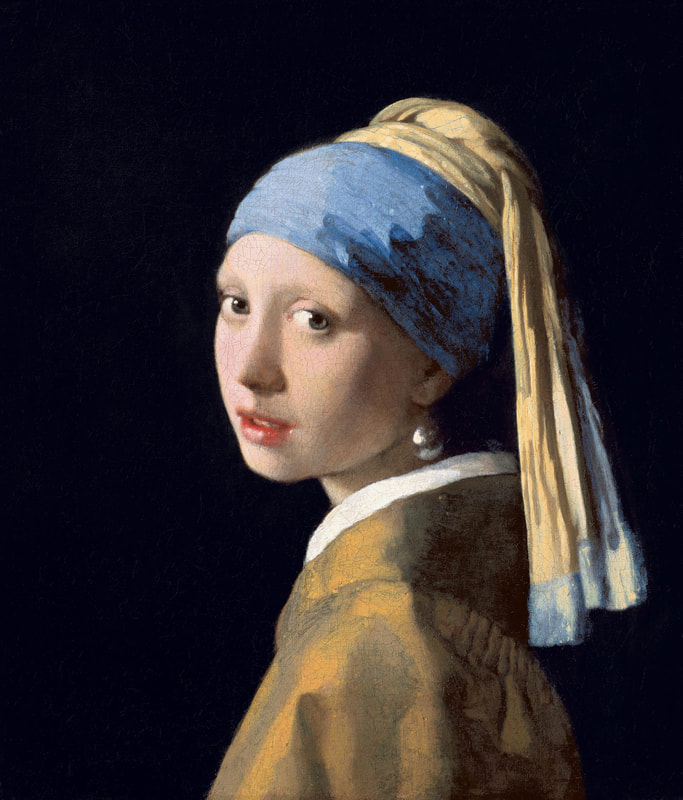
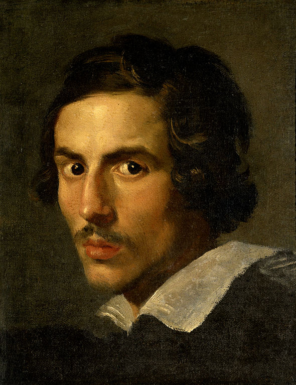
Girl with the Pearl Earring by Johannes Vermeer, 1665 and self-portrait by Gian Lorenzo Bernini, 1623
|
I wanted to paint my face realistically to give it a sense of realness that contradicted the elegance of Art Nouveau and allowed me to communicate the negative toll feminine beauty standards have on self confidence, and for this reason I was drawn to the Baroque period. The term “Baroque” was initially used to describe the excess emphasis found in the pieces, stemming from the use of heavy contrast between values, shadows, etc. to give faces realistic features. In Girl with the Pearl Earring by Johannes Vermeer and Gian Lorenzo Bernini’s 1623 self portrait, for example, heavy contrast can be seen between the shadows, highlights, and natural contours of the face. The solid background composed of solely negative space ensures that emphasis is placed on the face, giving the facial features and light in the eyes senses of wisdom and experience. I was particularly inspired by these realistic features along with the solid background, since they would allow me to place further emphasis on my face and also experiment with creating a range of tones and blending using acrylic paints and a variety of brushes.
|
Planning Sketches
|
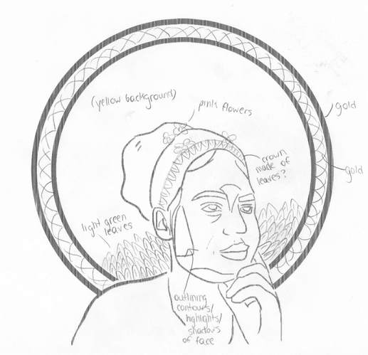
For my first planning sketch, I considered placing my face and shoulders directly in the center of the canvas, then creating symmetry by adding two gold circles around it and curved gold lines between the two circles. I initially planned to add light green leaves to the upper and bottom corners of my canvas to emulate the floral designs of Mucha's illustrations while also retaining the solid backgrounds seen in Baroque portraits. I felt that also adding leaves and flowers to my hair would further communicate my theme of elegant feminine beauty standards and how much they negatively impact the self-confidence of those engulfed in it; by incorporating these features, I'd be able to add more balance to the piece while simultaneously placing emphasis on my face. In order to preserve the realistic style of Baroque portraits and determine what areas of the face would include shadows, I took a photo of my face then sketched it, including noticeable contours and outlining the different values and tones that were visible.
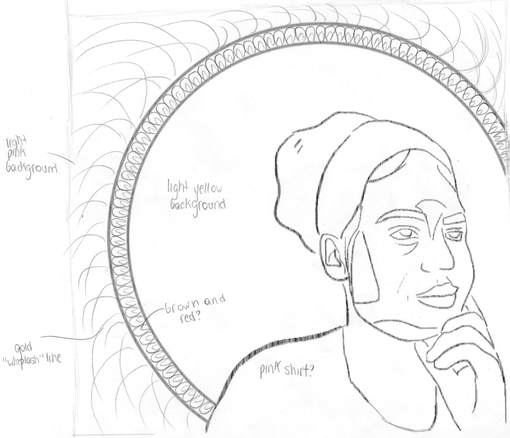
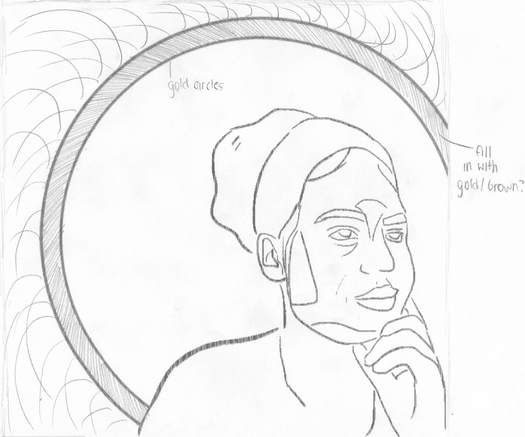
For my second planning sketch, I decided to sketch my face and shoulders in the lower right corner of the canvas, but keep the two gold circles surrounding it to preserve Mucha's trademark style.. I experimented with drawing detailed geometric designs inside these two circles in order to take advantage of the size of the canvas and the range of acrylic paints. I also added gold curved lines to the outside of the circle in order to ensure that the left portion of the canvas was balanced with the my face. In order to preserve the solid backgrounds found in Baroque style pieces, I did not sketch any intricate designs within the inner area of the circle holding my face. However, I found that there was great contrast between the negative space between the inner and outer area of the circles, since the outer areas looked significantly more cluttered and busy compared to the inner circle, and I ultimately decided not to use this planning sketch. For my third and final planning sketch, I used the same placement of my face and the two gold circles as my second sketch, but removed the intricate designs within the circle and instead decided to fill it in with a darker tone with a small amount of gold/shimmer to it. I wanted to make it clear that my inspiration also included Baroque period, and I felt that combining the general balance, symmetry, and unity with the simple, solid backgrounds of negative space behind realistic subjects would be able to communicate this. I kept the gold lines on the outer edge of the circle in order to communicate the theme of stereotypical feminine beauty and elegance, since it helped emphasize my face and other physical features (i.e. hair, hand, shoulders, etc.) while also adding my balance to the piece. |
|
Process
1. In initially began working on my self portrait by creating the 3 feet x 3 feet canvas by cutting out the canvas material and attaching it to canvas stretchers using a staple gun; I made sure I was pulling the canvas while doing so to ensure that it was neither too loose nor too tight to prevent it from getting warped after the gesso was applied. I cut the excess canvas off the corners to give it a more clean look, then added two coats of gesso to the canvas to prepare it for the acrylic paints. 2. After creating the canvas, I replaced my drawing of my face and neck in my final planning sketch with a photo of myself in the same position in order to give my piece a more realistic look when I began painting it. Since I wanted to emulate a Baroque style portrait in my face area specifically, I felt that it was important to do this particular step, since it would make it significantly easier to plan out the areas and tones I was going to use to give my face accurate values, shadows, highlights, etc. |
|
3. I then projected this final planning sketch on my canvas and used a pencil to lightly sketch out my face, in addition to the circles surrounding it, since I wanted my final piece to emulate the geometric shapes surrounding the figures in Mucha's Art Nouveau posters. The accuracy of these curves lines/circles was extremely important to me, as they emphasized my face and made it the focal point.
4. I first began painting the pink background on the outer edge of the top circle by mixing white with red to create a light pink tone and using a large flat brush. Rather than using bold or primary colors, I decided to consistently use lighter tones to more closely emulate an Art Nouveau color scheme and further emphasize the Baroque style features of my face, neck, and hair. I made sure to paint the sides of my canvas rather than solely the front in order to give it a neater composition.
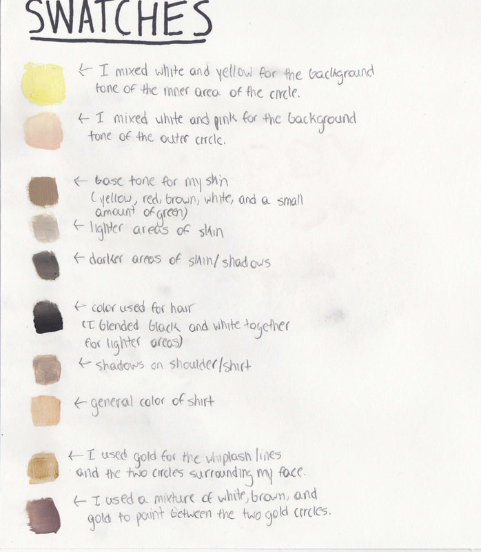
5. Before painting the background of the inner circle, I started painting my face and a base color for my hair using a medium sized flat brush. In order to create a skin tone that was appropriate for me, I mixed red, brown, yellow, green, and white and applied each of my experimented swatches onto my hand; I then chose the tone I felt was most similar to my own. I divided my face and next into sections depending on the values and shading required to give my face a realistic, Baroque style appearance, then blended these by adding an additional layer of tones and using a small amount of paint thinner and water. For example: I mixed white with my skin tone near my cheek area to emphasize the light bouncing off my skin. and in order to create a gradient of tones on my cheek that led to the shadows near my nose and eye, I blended the lighter area with the darker area (brown + skin tone) with my watered down skin tone. I used a similar method on my forehead, chin, neck, and fingers. For more precise details, such as my eyebrows, eyelashes, and lash line, I used a small pointed brush and mixed black and white with my skin tone.
6. I painted a basic outline of my hair using a darker base color (brown + brown + white) in order to know where to paint the background of the inner circle; I would later go over the base color of my hair with lighter curls to give it more texture and a realistic look. Using a large flat brush, I mixed white and yellow to create a light yellow tone, and painted the background and the outline of my hair, neck, and shoulder.
7. Using gold paint, I painted the two circles surrounding my face, using paint thinner and a medium flat brush to ensure that the lines were smooth and precise. After the paint completely dried, I painted the inside of these two circles using the same brush and white and brown paint; I then coated this base color with another layer of gold in order to incorporate a more shimmered look in my piece.
8. Although I didn't sketch out the specific lines and curves I was going to paint in the outer circle area, I started painting these with a medium flat brush and gold paint; I was primarily aiming to emulate lines and curves similar to those seen in the strands of hair in Art Nouveau posters. Additionally, I felt it was important that there was balance between these lines, and that they aided the overall symmetry of my self portrait, so I overlapped them to create a more cluttered look that balanced out with my face.
9. To finalize my piece, I added a number of green leaves near my shoulder area using a mixture of dark green (green + a small amount of black) and light green (white + green) to emphasize the shadows and highlights. I then painted my shoulder and emphasized the folds in the shirt using a range of pink tones that were all slightly darker than the outer background in order to create a clear distinction between the shape of my shoulder.
4. I first began painting the pink background on the outer edge of the top circle by mixing white with red to create a light pink tone and using a large flat brush. Rather than using bold or primary colors, I decided to consistently use lighter tones to more closely emulate an Art Nouveau color scheme and further emphasize the Baroque style features of my face, neck, and hair. I made sure to paint the sides of my canvas rather than solely the front in order to give it a neater composition.
5. Before painting the background of the inner circle, I started painting my face and a base color for my hair using a medium sized flat brush. In order to create a skin tone that was appropriate for me, I mixed red, brown, yellow, green, and white and applied each of my experimented swatches onto my hand; I then chose the tone I felt was most similar to my own. I divided my face and next into sections depending on the values and shading required to give my face a realistic, Baroque style appearance, then blended these by adding an additional layer of tones and using a small amount of paint thinner and water. For example: I mixed white with my skin tone near my cheek area to emphasize the light bouncing off my skin. and in order to create a gradient of tones on my cheek that led to the shadows near my nose and eye, I blended the lighter area with the darker area (brown + skin tone) with my watered down skin tone. I used a similar method on my forehead, chin, neck, and fingers. For more precise details, such as my eyebrows, eyelashes, and lash line, I used a small pointed brush and mixed black and white with my skin tone.
6. I painted a basic outline of my hair using a darker base color (brown + brown + white) in order to know where to paint the background of the inner circle; I would later go over the base color of my hair with lighter curls to give it more texture and a realistic look. Using a large flat brush, I mixed white and yellow to create a light yellow tone, and painted the background and the outline of my hair, neck, and shoulder.
7. Using gold paint, I painted the two circles surrounding my face, using paint thinner and a medium flat brush to ensure that the lines were smooth and precise. After the paint completely dried, I painted the inside of these two circles using the same brush and white and brown paint; I then coated this base color with another layer of gold in order to incorporate a more shimmered look in my piece.
8. Although I didn't sketch out the specific lines and curves I was going to paint in the outer circle area, I started painting these with a medium flat brush and gold paint; I was primarily aiming to emulate lines and curves similar to those seen in the strands of hair in Art Nouveau posters. Additionally, I felt it was important that there was balance between these lines, and that they aided the overall symmetry of my self portrait, so I overlapped them to create a more cluttered look that balanced out with my face.
9. To finalize my piece, I added a number of green leaves near my shoulder area using a mixture of dark green (green + a small amount of black) and light green (white + green) to emphasize the shadows and highlights. I then painted my shoulder and emphasized the folds in the shirt using a range of pink tones that were all slightly darker than the outer background in order to create a clear distinction between the shape of my shoulder.
|
Experimentation
Although I had worked with acrylic paints before, I had never used them to create such a large-scale painting, meaning that the process involved instinctive experimentation. When initially applying the paint to my canvas (specifically by my face and shoulder), I experimented with mixing water with paint in order to add a light base coat of paint. I found that this laid out a framework for blending and adding shadows, which I completed at the end of my painting process. Since Baroque style portraits are highly realistic and give the subjects of their pieces a sense of character and humanity, I felt that it was extremely important to form an outline for planning where to paint certain tones, since lighter and darker tones create the appearance of highlights and shadows and I had little experience doing this. I also experimented with paint thinner for the first time, and found it especially helpful when painting my face and neck because I used the same mixed paint over the course of a few weeks to paint this area. Although I stored it in a sealed container, the paint began to become more sticky as the weeks progresses, and I found that small amounts of paint thinner were able to moisten and smooth out the paint after this occurred. Since I was working with a 3 feet x 3 feet canvas, I often experimented with using the paint thinner when painting my face and shoulders, since I need to cover a larger amount of area with a limited amount of paint, and the paint thinner resulted in smaller amounts of paints lasting longer. |
I experimented with a wide range of brushes when painting the gold lines and circles in addition to the solid pale backgrounds. Art Nouveau posters and Mucha’s illustrations were significantly smaller than the canvas I was working with, meaning that it was most likely more difficult to incorporate smaller, more intricate details into his pieces. Although I chose not to include extreme details such as textured leaves in my final piece (I wanted to preserve the solid background similar to that in Baroque pieces), I found the large scale of the canvas helpful when I experimented with larger flat brushes to paint the thin circle surrounding my face and the thin, curved lines on the outer edge of this. By using larger brushes rather than thin, small ones, I was able to cover more area over a shorter period of time.
I also experimented with adding individuals curls to my hair over the base coat of dark brown/black paint by using a thick black marker. However, I found that this process was extremely time consuming due to the fact that the canvas was so large, and the marker created a glare that to did not emulate the realistic texture in hair found in Baroque pieces. I decided to paint over the marker and use acrylic paints instead.
I also experimented with adding individuals curls to my hair over the base coat of dark brown/black paint by using a thick black marker. However, I found that this process was extremely time consuming due to the fact that the canvas was so large, and the marker created a glare that to did not emulate the realistic texture in hair found in Baroque pieces. I decided to paint over the marker and use acrylic paints instead.
Reflection
Overall, I'm generally pleased with my piece and feel that I was able to combine the simplicity of Baroque background with its realistic textures and tones, in addition to the use of pale tones geometric and organic lines and shapes in Art Nouveau illustrations; this helped me communicate the idea of superficial feminine beauty and how it takes a toll on the self-confidence of those it surrounds. However, I could have added more geometric patterns and details, especially between the gold circles and near my hair, to further emulate the style of Mucha and Art Nouveau posters. Since the canvas was so large, I could have used to my advantage even more than I did by creating smaller details that would have been more difficult to create if a smaller area/canvas was provided. I feel that these smaller details, when combined with a pale/pastel color scheme, would have allowed me to communicate my theme of superficial feminine beauty to a greater extent, since I could have heightened feelings of extravagance and how it coincides with self-confidence issues.
However, although my face and hair did not end up being as realistic as I had originally anticipated, for my personal skill level, I feel that the shading and range of tones and values applied to my face, neck, and hair were satisfactory. Although acrylic paints dry fairly quickly, I was able to take advantage of water and paint thinner to aid the blending process and add darker and lighter tones to shadows and highlights. Although I was able to mix white with yellow and pink paints to create pale tones to emulate Mucha's typical color scheme and the solid backgrounds of Baroque portraits, I had difficulty creating a tone that matched my skin. During my initial process of finding the tone most similar to my skin, I painted swatches onto my hand, but these were only light layers of swatches, meaning that I was unable to see how dark the tone was compared to my skin. I only realized this after applying a few layers of paint to the canvas, meaning I had to go back with progressively lighter tones for my skin tone to eventually match. Since I centered the pale solid tones and gold lines around the tone of my face, this was a major setback, since the color scheme wasn't as appealing and didn't hold as much unity as Mucha's illustrations.
ACT Responses
1) Clearly explain how you are able to identify the cause-effect relationship between your inspiration and its effect upon your artwork.
The Art Nouveau period was known for its glorification of women through symmetrical, pastel illustrations with intricate designs and patterns. Baroque portraits emphasized shadows and contrast in the areas of the face to give subjects senses of character and realism.
2) What is the overall approach (point of view) the author (from your research) has regarding the topic of your inspiration?
Mucha used intricate, floral designs in his illustrations and posters to add a sense of elegance surrounding the women and place emphasis on their poised position. Baroque artists such a Bernini and Vermeer sought to emphasize the character and realness of their portrait subjects through the use of contrast of values and tones.
3) What kind of generalizations and conclusions have you discovered about people, ideas, cultures, etc. while you researched your inspiration?
Art movement are often centered around human subjects and are meant to either drown out the true identity of the individual by romanticizing their features or emphasize character by adding realistic features such as tone and texture to the face.
4) What was the central theme or idea around your inspirational research?
The them/idea around my inspirational research was centered around how specific elements of art either emphasize the true identity of an individual (i.e. contrast and texture in Baroque portraits) or mask them (i.e. Mucha's use of flowers and patterns to emphasize the beauty of women).
5) What kind of inferences (conclusions based on your evidence and reasoning) did you make while reading your research?
Art movements are able to place emphasize on human subjects by using contrasting backgrounds and/or intricate designs surrounding the subject, and can also simultaneously communicate their central themes through similar features.
SOURCES
C. G. (2006, October). Art Nouveau | Essay | Heilbrunn Timeline of Art History | The Metropolitan Museum of Art. Retrieved December 16, 2017, from https://www.metmuseum.org/toah/hd/artn/hd_artn.htm
The Editors of Encyclopædia Britannica. (2016, January 03). Baroque art and architecture. Retrieved December 6, 2017, from https://www.britannica.com/art/Baroque-art-and-architecture
Janson, J. (n.d.). Girl with a Pearl Earring. Retrieved December 6, 2017, from http://www.essentialvermeer.com/catalogue/girl_with_a_pearl_earring.html#.WjOHRLQ-e3U
J. Paul Getty Trust. (n.d.). Bernini and the Birth of Baroque Portrait Sculpture. Retrieved December 6, 2017, from http://www.getty.edu/art/exhibitions/bernini/slideshow.html
Mucha Foundation. (n.d.). Rêverie (1898). Retrieved December 6, 2017, from http://www.muchafoundation.org/gallery/browse-works/object/78
Mucha Foundation. (n.d.). Zodiac (1896). Retrieved December 6, 2017, from http://www.muchafoundation.org/gallery/browse-works/object/242
