|
|
|
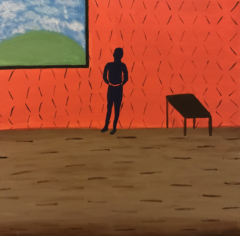
Title: Gloom
Size: 61cm x 61cm Medium: Acrylic on Canvas Date: July 2018 |
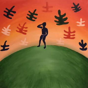
Title: Liberation
Size: 61cm x 61cm Medium: Acrylic on Canvas Date: July 2018 |
Exhibition Text
Gloom and Liberation are a series of acrylic paintings meant to show the power of the mind in terms of one’s will to pursue their dreams. Inspired by the abstract shapes and figures in Henri Matisse’s work, in addition to his utilization of setting, both pieces recreate the solid, human-like figures in his work and his use of leaf-like shapes. The figures in each piece are emphasized through contrasting backgrounds alongside the incorporated movement, balance, and harmony.
Gloom and Liberation are a series of acrylic paintings meant to show the power of the mind in terms of one’s will to pursue their dreams. Inspired by the abstract shapes and figures in Henri Matisse’s work, in addition to his utilization of setting, both pieces recreate the solid, human-like figures in his work and his use of leaf-like shapes. The figures in each piece are emphasized through contrasting backgrounds alongside the incorporated movement, balance, and harmony.
Inspiration
|
For this particular project, I wanted to create a series of paintings signifying the contrast between strain and freedom, and in order to do so, I decided to use interior and exterior settings as symbols of the power of the mind. Because of this, I chose to research Henri Matisse’s abstract style, use of organic shapes, and settings in his paintings, and found that I was drawn towards Dance II and Red Interior, Still Life on a Blue Table, Blue Nude, and Red Room specifically.
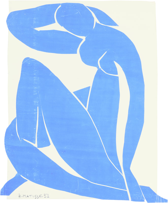
Henri Matisse was a notable contributor to the Fauvism and Expressionism movements. Leaning towards abstract styles in his later work, Matisse took advantage of solid tones and organic shapes to incorporate human-like figures and plant-like designs in his pieces. Rather than adding intricate details to the figures in his pieces, he used dark tones - often blue or black - in addition to organic shapes for the limbs, torso, and head in order to emphasize their outlines and figures, as seen in Blue Nude. Many of his works incorporated floral and plant-like shapes; I was inspired by these shapes in La Perruche et La Sirene, which not only utilize solid tones, but add symmetry and balance to the piece. 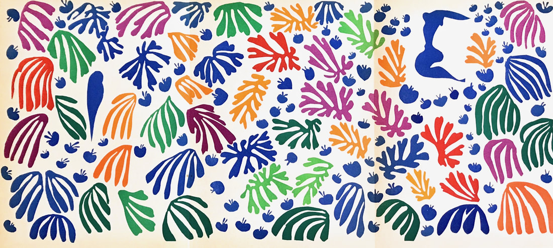
La Perruche et La Sirene by Matisse
(click to expand image) |
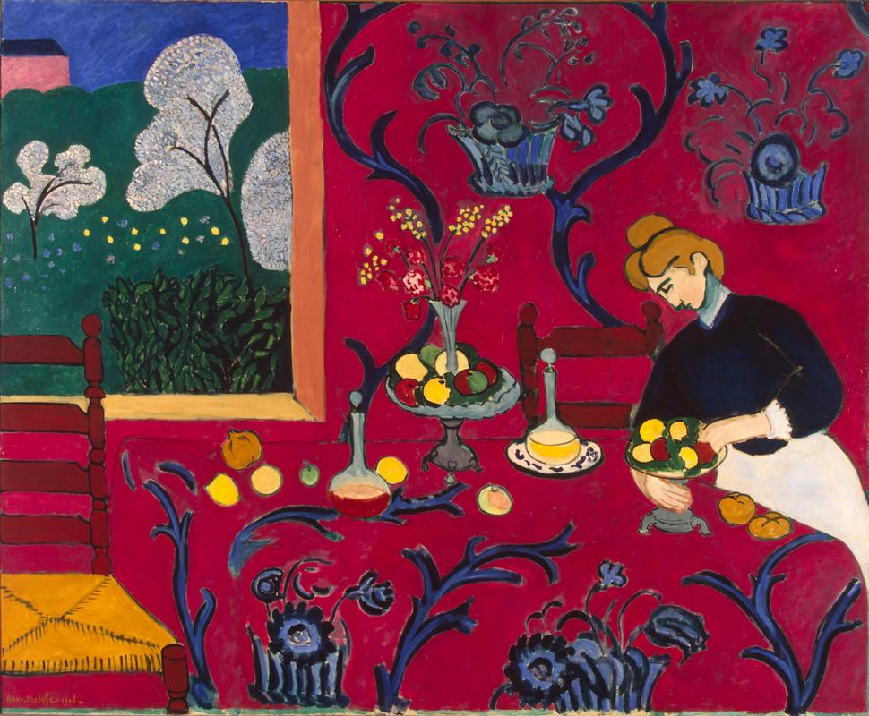
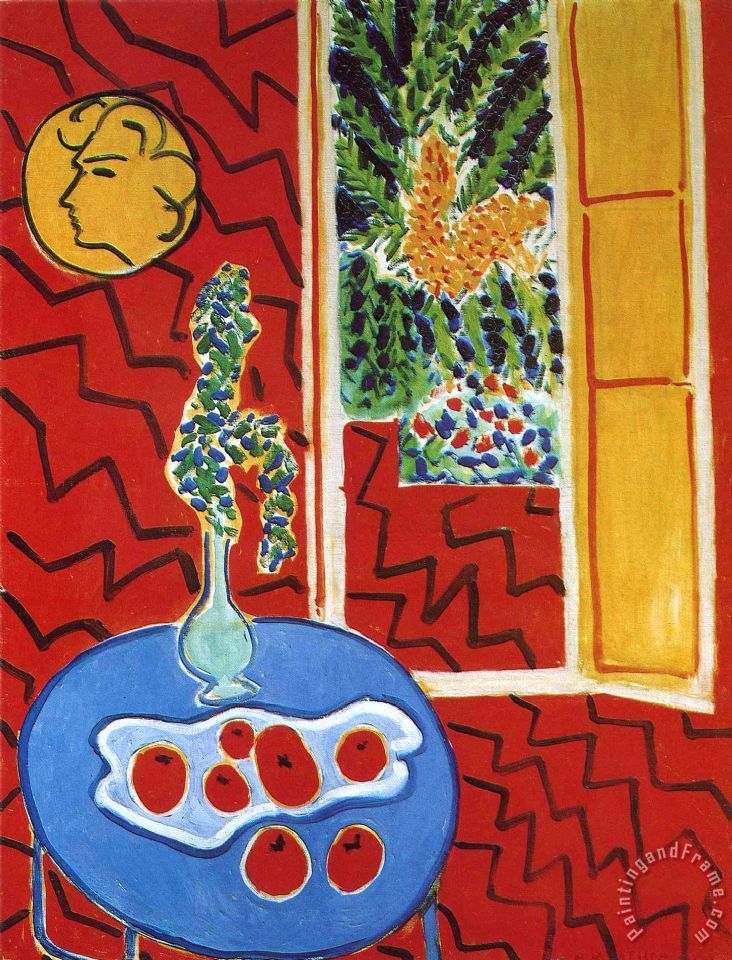
Red Room and Red Interior, Still Life on a Blue Table by Matisse
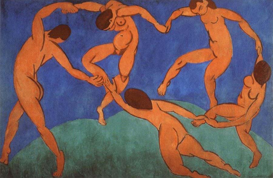
(click to expand images) Dance and Blue Nude by Matisse
(click to expand images) Matisse's use of interior and exterior settings are clear in Dance, Red Room, and Red Interior, Still Life on a Blue Table. He is able to occupy the entire canvas by transforming everyday objects and terrain into abstract, organic structures; his use of the contrasting tones of these settings in the background adds emphasis to the figures of each piece and also allows for movement. I ultimately decided to use the background of Red Interior, Still Life on a Blue Table in my first piece and the background in Dance in my second.
|
Planning
|
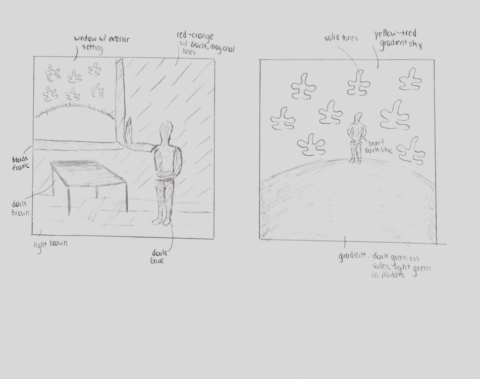
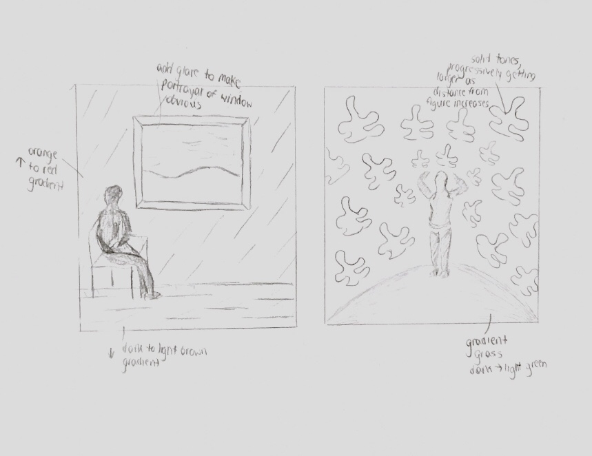
For my first planning sketch, I drew a window in the top left corner of the room and considered having it cover a large portion of the canvas rather than a small area. I then drew a figure leaning on the side of this window to give the appearance of contemplation or stress, and in order to incorporate symmetry in the sketch, I drew a table directly below the window. To heighten the intensity/feelings of stress with the piece, I considered adding jagged lines to the floor and background wall. The sketch to my second piece was similar to the final product since both use the leaf-like, solid shapes to add balance and symmetry to the piece and have a gradient in the grass area and sky for emphasize the figure. However, this sketch did not portray the center figure as I wanted it to be; I felt that its position was too neutral and the body shapes were not distinguishable from one another.
|
(click to expand images)
|
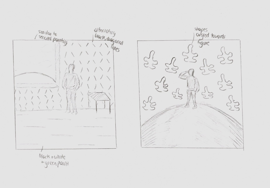
My second sketch for the first piece was identical to the others but incorporated a window in the center of the canvas rather than in either of the top corners, and instead of using a table or chair for balance or symmetry, a chair was utilized to emphasize the figure sitting in it peering out the window in a contemplative state. However, I felt that I would be unable to show that the window was not a painting, even if I did add glare to this area, and I felt that the window was an essential aspect of communicating a sense of longing. For my second sketch, I used the same leaf-like shapes as in my other two sketches, but drew them increasing in size as they moved farther away from the figure facing the opposite direction of the viewer to make it seems as if these shapes were radiating off of the figure. However, I found that this created more emphasis on the shapes and the sky rather than the figure itself.
My final two sketches that I ultimately selected for my final pieces placed the most emphasis on the figures while also incorporating balance and a range of tones. I felt that I’d be able to successfully communicate mental feelings of longing and a more depressive state by adding jagged lines to the wall and on the floor while also adding a window to the corner of my first piece. In contrast, I felt that my second piece, if I used this sketch, would successfully utilize tones and organic shapes to create the sense that the figure, also previously seen in the first piece, began to thrive, acting as a symbol for the power of the mind and its connection with the world. |
Process: Gloom
|
1. To begin, I divided to bottom 1/3 ad top 2/3 of the canvas by drawing a straight line that acted as a separation between the floor and wall. I then drew a window frame in the upper left corner of the canvas, similar to the one seen in Red Room.
2. By mixing brown, white, and green paint, I created a light brown tone that I used to paint the floor and give the appearance of old wood. 3. By mixing white, red, and yellow paint, I created an orange tone that I used to paint the wall on the upper 2/3 of the canvas. 4.I then painted the view from the window by mixing white and green to create light green and painting a half circle in the lower third of the window frame and painting the rest light blue. In order to create clouds, I dabbed a small sponge over the blue area. To add pieces of grass, I lightly rubbed a fan brush slightly above the green half circle. 5. I painted a black frame surrounding this to preserve the balance and movement of the piece. 6. To preserve Matisse's unique style, I drew a figure by using separate, organic shapes and placing a gap between the torso and the legs; I then painted in dark blue with a flat, rounded brush, giving the appearance of a shadow rather than a figure. Next to this figure, I painted a brown table using freehand perspective to preserve Matisse's organic, abstract style. 7. To finish up the piece, I added alternating, diagonal lines on the background wall and streaks of darker brown paint on the wood, with thicker streaks towards the bottom to add the appearance of a shadow on the bottom on the canvas. |
|
Process: Liberation
|
|
1. To begin, I lightly drew the upper half of a circle dividing the bottom ⅓ of the canvas from the upper ⅔ in order to create an outline for the grass/ground similar to that seen in Matisse’s Dance II.
2. I then painted this area with a light green (white and dark green paint mixed) with a curved, right to left sweeping motion and a large brush. This ensured even coverage and an opaque base coat I could add onto. 3.In order to add more perspective to the grass area, I added white paint to the center of this area while the previous layer of paint was still wet, then painted the corners with dark green paint. This gave the appearance of a center closer to the viewer of the painting. 4, For the upper ⅔ of the canvas, I added thick layers of solid red, orange, yellow, and peach from top to bottom respectively rather than beginning with a solid layer first. By using a larger brush, I was able to blend these tones with ease and create a gradient effect for the sky. 5. Once the entire canvas was dry, I measured out the vertical center of the canvas and drew a figure in the style of Matisse, placing it as if it were standing on the grass. In order to successfully emulate his style, I viewed the figure as a composition of smaller organic figures and drew them one by one, beginning with the head and moving to the arms, torso, then legs. I made sure to indicate areas where I wanted there to be negative space between the shapes, such as between the upper arm and upper torso. |
6. Drawing inspiration from La Perruche et La Sirene, I drew similar leaf-like shapes surrounding this figure, each leaning in its direction to add movement to the piece and add emphasis to the figure
.
7. I then painted the figure solid blue, adding an additional layer of paint once the first dried in order to ensure that it was opaque. I moved onto the shapes surrounding the figure in the sky and used the same method, using red, peach, green, and blue to balance out the tones on each side of the canvas and add more balance to the piece.
8. I finished up the piece by adding dark green streaks of paint to the bottom corners of the canvas to further emphasize the depth of the grass area.
Experimentation
|
|
Gloom When creating Gloom, I experimented with a range of paintbrushes in order to have the most precision when filling in areas with solid tones. I originally used a flat, slanted brush when filling in the blue figures, but found that I did not have enough control of the brush when painting curved areas, since the general structure of the figure was organic rather than geometric. I turned to using a flat, round brush instead, and soon realized that this made it much easier to fill in smaller areas such as the arms and calves.
In contrast, I found that using a slanted brush when painting the table made it easier to form the edges and table legs, since the shape was generally geometric and had straight lines that I were able to outline first, then fill in the remaining area with a thick layer of paint. The original view from the window was very bland and did not balance out with the table on the right side of the piece, and in order to add more details to this area, I used a small sponge dipped in a small amount of white paint to add clouds to the sky. By using a dabbing motion, I was able to create realistic clouds that made the sky less plain. I then experimented with using a fan brush to add individuals strands of grass to the top of the half-circle I had painted. Liberation When creating Liberation, I originally painted the grass area with a layer of light green, and, when still wet, added green paint on the sides and white in the center to give this area more perspective. However, I found that the darker green did not show and rather blended completely with the lighter green when it was wet. I experimented with using darker green paint over dry paint instead, and in order to do so, used a medium sized, flat brush to add thick green streaks to the corners of the canvas that progressively got thinner and more sparse. These streaks, I later realized, made the center of the grass area appear lighter and therefore helped me achieve a rounded perspective of this area.
|
Reflection
Overall, I feel that my second piece, Liberation, most closely resembles Matisse's style, since I fully utilized his leaf-like, organic shapes that are seen in La Perruche et La Sirene, and by incorporating them into my piece, I was not only able to incorporate overall balance and symmetry, but also place emphasis on the center figure. I wanted to make it clear that the figures in the same piece were meant to represent the same individual, and I successfully did so by adding the window in Gloom with view of the same setting as Liberation, in addition to using the same tone and general shape for each figure.
However, I could have made a stronger connection to my overall theme. I wanted to emphasize the power of the mind in terms of outlook on the work, using the interior and exterior settings as symbols of these restrictions and freedoms, and I feel that the tones and patterns used in each piece effectively do emphasize this, However, if I had been more free with the shapes of the figures and given myself more room to make them look even more abstract, I may have been able to use their body language to also express the feelings of each piece and the effect of the setting on the individual. Overall, I feel that the figures were too stiff.
Additionally, I feel that my first piece, Gloom, did not completely fill the canvas in the way that Matisse would. As seen in Red Room, Matisse crowds the canvas with intricate, abstract shapes on the wall and using a range of tones when doing so; he does not waste any area, but there is still a sense of balance and and negative space is still clear. If I were to recreate Gloom, I'd remove the floor and use only the wall as a background, then add more furniture and more leaf-like designs behind the figure on the wall.
z
ACT Responses
1) Clearly explain how you are able to identify the cause-effect relationship between your inspiration and its effect upon your artwork.
I drew inspiration from Matisse's abstract style in terms of his figures and interior and exterior settings and was able to utilize this in both of my final pieces in the foregrounds and backgrounds. Additionally, I decided to use solid tones in the leaf-like figures I painted in Liberation, drawing inspiration from La Perruche et La Sirene.
2) What is the overall approach (point of view) the author (from your research) has regarding the topic of your inspiration?
Matisse took an alternative approach to his environment by using abstract designs, solid tones, and intricate details in his pieces. Rather than painting and creating realistic work, he chose to combine organic shapes and a range of solid tones in his pieces to incorporate balance, symmetry, and emphasis of figures in his creations.
3) What kind of generalizations and conclusions have you discovered about people, ideas, cultures, etc. while you researched your inspiration?
Through my use of interior and exterior settings in my paintings as symbols for the power of the mind on general outlooks on life, I was realized that art does not only have an effect on people in terms of color, shape, and other elements and principles of design, but in terms of the objects and locations presented in the piece, even if they are not aware of it.
4) What was the central theme or idea around your inspirational research?
My inspirational research revolved around using human-like figures, abstract shapes, and setting as symbols for the mind or mental state, leading me to discover Matisse's work because many of his paintings revolve around individuals in interior and exterior settings, and the use of shapes and tones in these settings allowed me to understand their significance.
5) What kind of inferences (conclusions based on your evidence and reasoning) did you make while reading your research?
Through my research, I can conclude that
dire threat to the African American community
Bibliography
Henri Matisse. (2017, April 28). Retrieved July 30, 2018, from https://www.biography.com/people/henri-matisse-
9402564
9402564
