Project #2 - Digital Collage

|
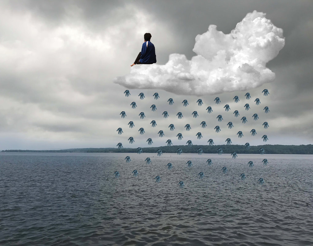
Title: Harmonious
Size: 61cm x 91cm Medium: Digital Collage Date: September 2018 Exhibition Text
Harmonious is a digital collage inspired by the surrealist works of René Magritte that explores my connection with nature and how the balance of our contributions to one another aids my prosperity and stability. The digital collage was heavily inspired by the use of clouds and a nature-like setting in Le Temps Menacant and La Corde Sensible, along with to the symmetry of the “raining” men in Golconda. The use of blue-tinted hands as raindrops and my figure resting on the cloud emphasizes my oneness with nature. |
Inspiration
|
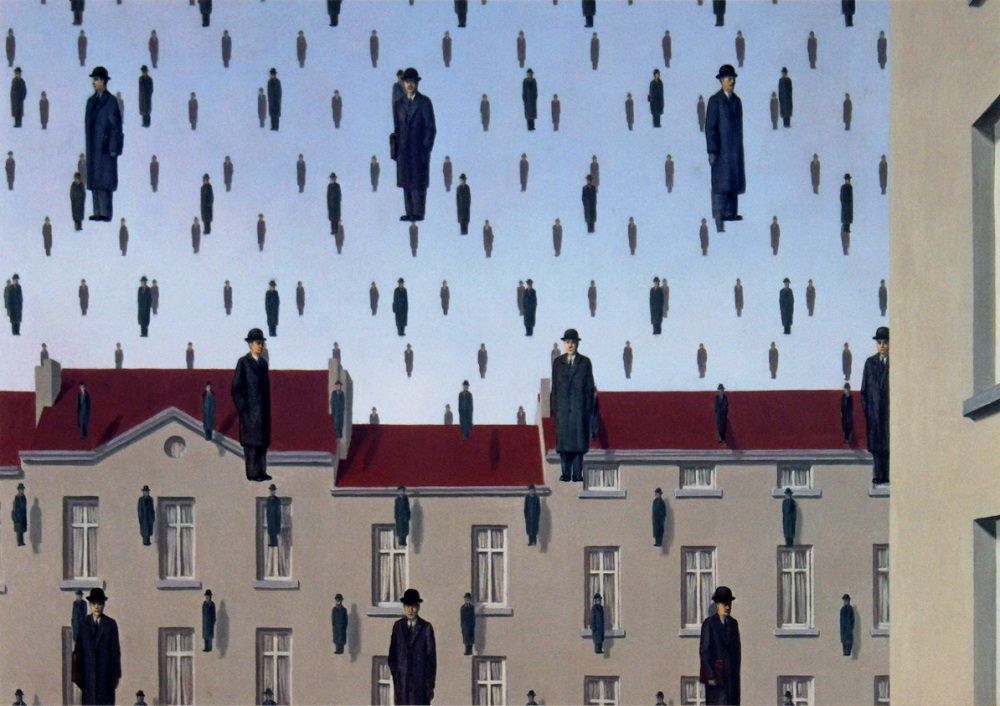
I had previously used René Magritte’s surrealist paintings as inspiration for two illustrations I made using colored pencil on illustration board, but I was displeased with my ability to emulate the hyperrealistic look of his pieces. Because of this, I was inspired to research more of his work and create a digital collage based on a few of his paintings. I was drawn to Le Temps Menacant, La Corde Sensible, and Golconda specifically. Both Le Temps Menacant and La Corde Sensible manipulate clouds and make them the focal point of the piece, while Golconda depicts raining men that are symmetrically positioned and aid the overall balance of the piece.
|
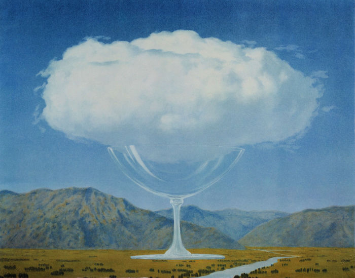
Le Temps Menacant and La Corde Sensible by Magritte
(click to expand images)
|
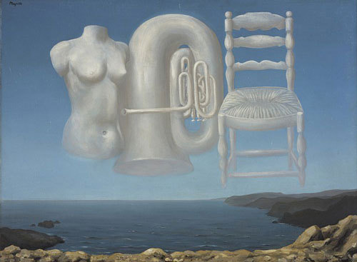

Surrealism and Magritte are most known for their ambiguity and skewed interpretation of the natural world; figures, objects, and nature are manipulated to evoke thought in the viewer, and this is done so by preserving memorable, realistic aspects of these figures and altering them (i.e. elongated arms on a human figure or clouds shaped like a specific object).

Golconda by Magritte
(click to expand image)
|
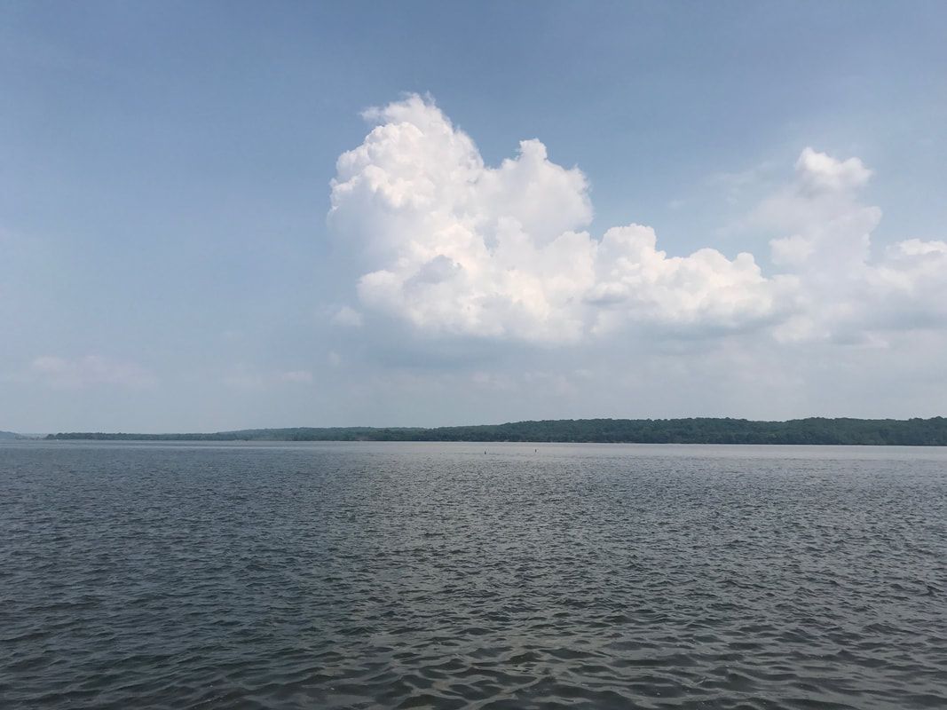
One thing that drew my attention in Le Temps Menacant and La Corde Sensible was the fact that the sky covers approximately ⅔ of each canvas, creating movement of the eyes towards the sky and the shape of the clouds. Additionally, both included terrain that appeared seemingly untouched by humans, and this inspired me to create a digital collage that heavily relied upon nature and the relationship I have with it. In Le Temps Menacant specifically, Magritte forms utilitarian objects and the figure of a woman. Because most of his work was meant to be ambiguous and hold a different meaning for each viewer, I interpreted the portrayal of these figures in the clouds as a symbol for the extraction of nature to accommodate a growing utilitarian world. I was influenced to create a juxtaposition between myself and the natural world to emphasize my impact on nature and its effect on me, and how this cyclical nature creates a balance that allows me to freely express myself.
|
I was also inspired by Golconda, which, unlike Le Temps Menacant and La Corde Sensible, contains primarily human-built structures and physically realistic figures. In both the painting’s foreground and background, men are symmetrically placed as if they are falling from the sky. Along with this, the structure of the buildings on lower half of the piece and on the right place emphasis on these men and incorporate balance and unity. Although much of the foreground and background are composed of these figures, there is still balance between the positive and negative space because of the contrast between the light blue tone of the sky in the background and the black coats on the figures. I was inspired to use a lighter background in my piece to emphasize the negative and positive space and the clouds and figures I would add to the foreground.
Planning
(click to expand image)
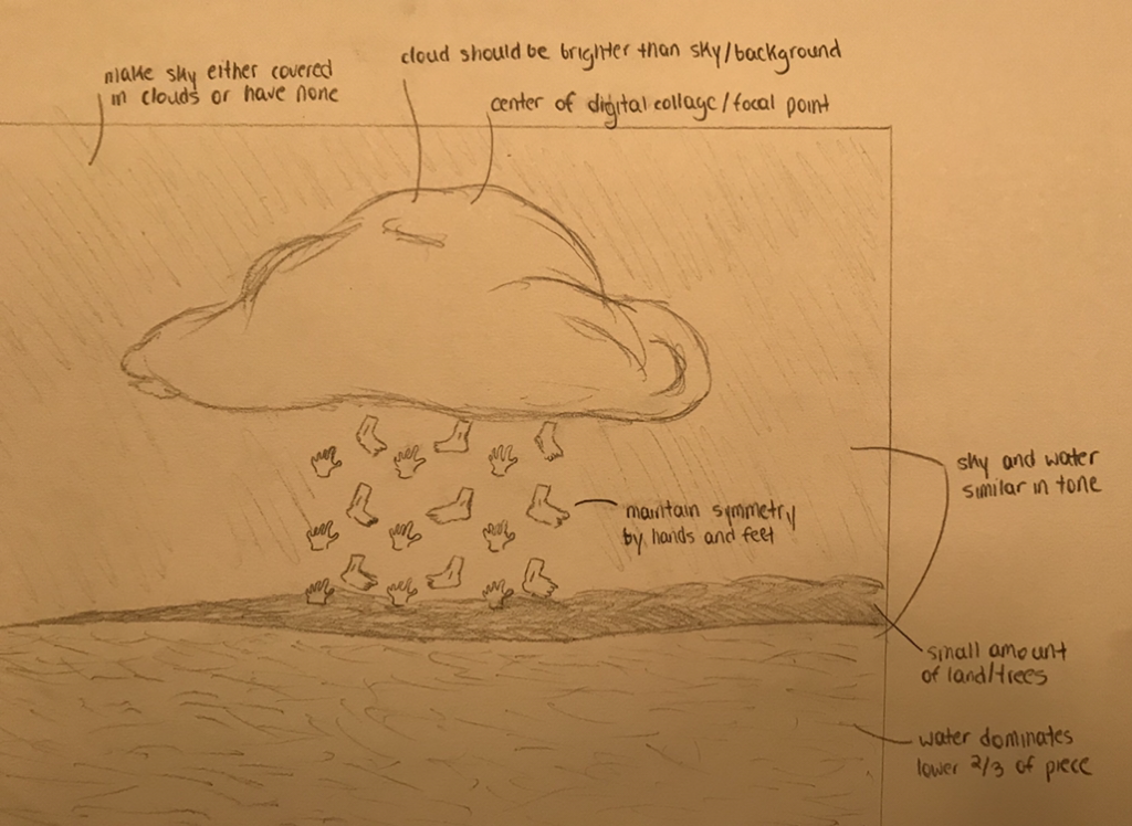
By my first planning sketch, I had already determined that I wanted my piece to incorporate a nature-like landscape similar to the ones seen in bottom ⅓ of the canvases in Le Temps Menacant and La Corde Sensible. I preferred the use of similar tones in the sky and in the water that was present in La Temps Menacant, so I ultimately decided to sketch a large body of water with a smaller amount of land. I then sketched a large, naturally-shaped cloud in the center (similar to the shape of the one in La Corde Sensible) because I wanted there to be symmetry and balance in the piece. I refrained from sketching a unnaturally shaped cloud like those in Le Temps Menacant because I wanted emphasis to be placed on the limbs (photos of my hands and feet) falling out of the cloud in the fashion of raindrops. In doing so, I hoped to emulate Golconda’s symmetry and use of negative and positive space, and I also hoped to communicate to viewers that my connection to the natural world around me stemmed from the balance between us and my contributions to the environment.
|
(click to expand image)
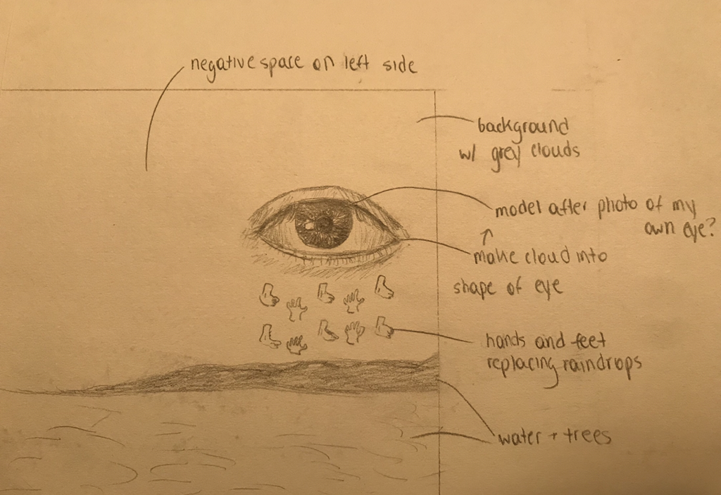
For my second planning sketch, I was already set on using the same background as my previous sketch, so I instead altered the shape of the cloud and its positioning in the foreground. Rather than using a realistic cloud, I sketched it in the shape after an eye to represent a oneness with nature and the ability to see its importance in terms of prosperity and stability. This planning sketch was more closely modeled after Le Temps Menacant than La Corde Sensible, but I did not place the cloud in the center because I wanted to incorporate movement in my piece. Additionally, I felt that by putting the cloud on either side of the digital collage would place more focus on the background and the vastness of nature, further reinforcing my theme. Similar to my last sketch, I emulated Golconda by sketching my legs and hands under the cloud in the same pattern as the men in Golconda.
|
(click to expand image)
|
|
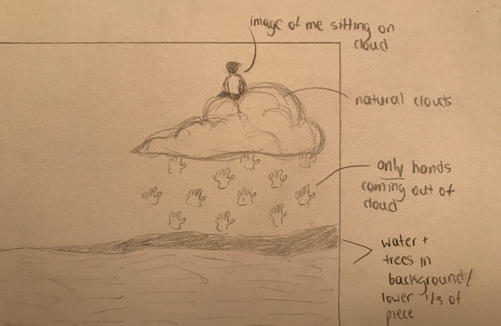
In my third and final planning sketch, I combined aspects of my first and second planning sketches while altering some aspects completely. I kept the background (the sky, water, and trees) the same, in addition to the positioning of the cloud from my second sketch. However, instead of modeling the cloud after those seen in Le Temps Menacant, I instead decided to simply use an unaltered, natural photo of a cloud in my final piece and just manipulate the raindrops coming from it. A major factor in this decision was my lack of confidence in Photoshop skills, and since my reasoning for returning to Magritte for inspiration was to create a more hyper realistic piece than I’d be able to create doing a hand drawn illustration, I ultimately decided to limit my manipulation of the cloud. Another major change in my final sketch concerned the raindrops composed of my limbs; I decided to only use my hands rather than both my hands and feet and emulate the repetition and symmetry that is seen in the identical men in Golconda. To reinforce my personal connection to nature, I also sketched myself sitting on the top of the cloud.
|
Process
1. To begin, I gathered a number of photos for both the foreground and background of my piece. Keeping in mind that I wanted to maintain balance throughout my digital collage, have a foreground with generally similar tones throughout, and maintain a strong connection to the aspects of nature seen in Le Temps Menacant and La Corde Sensible, I selected the following photos for my background:
(click to expand images)
|
2. Using Photoshop, I combined the water and trees from the bottom of ⅓ of the first photo and the sky/clouds from the second photo by removing everything but the aspects I wanted to keep in each photo by using the eraser tool. I soon realized that the division between the sky and the ground looked jagged and unnatural because of this, so I went over the trees and water with the smart brush to create a smoother transition.
3. The most significant part of my piece, in my opinion, was the cloud I would ultimately place in the foreground because it would act as one of my piece’s symbols for my strong connection to nature. Because of this, I wanted to make sure that I placed it in the foreground and heightened created slight contrast between its tones and the background. I used the lasso tool to cut out the large cloud in the photo I used for the water and trees, then smoothed out the edges and made it look more natural by using the eraser tool with a smoothness set to 80. |
|
4. At this point, I felt that the there was not enough contrast between the cloud and the background to place emphasis on it, so I went into the filter section of Photoshop and increased the contrast of and lightness of the cloud, giving it enough contrast from the foreground while also ensuring that my piece was composed of generally the same tones, similar to those seen in Le Temps Menacant.
5. After these aspects of my piece were finished, I added a photo of the palm of my hand as another layer. Using the lasso tool, I cut out the background of the photo, then removed any jagged edges or parts of the background I had missed with the lasso tool using the eraser with the smoothness set to 20 and the quick selection tool to delete areas.
6. Drawing inspiration from Golconda, I lowered the size of the layer of my hand and placed it directly below to cloud to make it look like a raindrop, similar to the men in Golconda. I then duplicated this layer multiple times and positioned them in the same pattern as the men in Golconda, and in doing, I was able to incorporate balance and symmetry in the area below the cloud.
7. One limitation I had was that I could not naturally heighten the contrast of the layers of my hand. In Golconda, Magritte uses dark clothing on the men to show contrast between them and the blue background, but since I did not wear a dark glove in the photo I took of my hand, I had to resort to using filters on Photoshop to increase their contrast with the clouds in the background. I changed the hue and made the layers a darker blue to resemble dark raindrops, but also made sure that they were not dark enough that they distorted the fact that they were my hands. However, I felt that altering the hue was necessary to communicate that my hands were supposed to resemble raindrops and communicate my connection to nature.
8. Lastly, I took a photo of myself sitting on a chair and facing away from the camera and added it as a layer on Photoshop. Using the lasso tool, I cut the background out along with the chair, then refined the edges using the eraser set to a smoothness of 20 and the quick selection tool. I found a curve on the cloud that would allow my body to appear as if it were sitting on it, then positioned the layer in this area. I made it small enough that it would not distract from the size of the cloud and prevent it from being the focal point of the piece, but large enough that it would be visible at a distance by the viewer of the piece.
Experimentation
|
Although I had edited photos in the past using similar softwares, I had little experience with Photoshop and this led me to experiment with the various tools provided with the software. Before I had duplicated my hand and placed each layer symmetrically below the cloud to emulate raindrops, I experimented with filters to create a less natural skin tone and one that made my hands appear as raindrops. After I had an established hue, I experimented with saturation levels and found that higher levels resulted in a bright blue tone that prevented harmony between the tones throughout my entire piece, and although I did want there to be contrast between the background and the hands, I still wanted to preserve the overall harmony of the piece.
I also gather a number of trial photos of clouds and took multiple photos of me sitting in various positions to test and ultimately select which one would fit the overall composition of my digital collage. I considered using a photo of my body with my face forward and looking directly at the viewer, but I quickly realized that this would distract from my theme of having a connection with nature and would rather strengthen the connection between me and the viewer. My primary goal was to show that I have a balance and am completely engulfed in nature and its positive mental effect on me, so I also considered using a photo of me with a downward gaze. However, when I added it as a layer to my digital collage, I felt that it added a more sorrowful emotion to my piece rather than a more optimistic and calm one. Once I had made a decision on which cloud to use as a layer in my piece, I experimented with its positioning in the foreground. I considered placing it on the left side with the smaller portion of it facing the left, but I ultimately decided on its final placement because it created the most movement. This was largely due to the fact that the trees in the bottom background are mostly on the right side and dwindle off as the viewers’ eyes move to the left; similarly, the cloud, when the image was horizontally flipped, it larger on the right and shorter on the left. Rather than maintaining balance throughout the entire piece, I decided to aid the movement towards the right side to emphasize the cloud. |
Photos of clouds I considered using for my final product.
|
Reflection
Overall, I feel that I was able to properly utilize my selected medium to emulate the hyperrealistic style of René Magritte.By using Photoshop rather than relying on hand drawn illustrations, I could manipulate natural settings and human figures while also keeping their recognizability intact. Additionally, I believe that my theme was properly conveyed in my digital collage because of the attention brought to the cloud, water, and hands/raindrops specifically; they allowed me to communicate the harmony and connection I have with nature and how there is a balance between my contributions and what it provides me in a visually literal sense.
|
|
Comparison to Le Temps Menacant
The main similarity between Le Temps Menacant and my final product was the use of water in the background and the use of similar tones throughout the entire piece. Harmony between the water and the sky is created in both pieces because they are both cool tones, and there is no noticeable contrast between these tones. Rather than manipulating the shape of the cloud in my piece like those seen in Le Temps Menacant, however, I instead decided simply add a layer of a large, naturally shaped cloud like the one seen in La Corde Sensible. |


|
|
Comparison to La Corde Sensible
Reflecting on the process stage of my project, I realized that I decided to use a naturally shaped cloud like the one in La Corde Sensible because I was skeptical of my Photoshop abilities. When going into this piece, my priority was to emulate Magritte’s hyperrealistic style that maintains a sense of familiarity yet eeriness in everyday objects, and I was afraid that attempting to alter the shape of the cloud without any skill foundation would prevent it from looking like a cloud altogether. Nonetheless, both my piece and La Corde Sensible use large clouds and their organic shape as a focal point, emphasizing the movement towards these particular components. |
|
|
Comparison to Golconda
Unlike Golconda, my piece only had such strong symmetry in the area below the clouds, which was formed by the placement of my hands in the same way that the men are positioned in Golconda. Golconda uses dark clothing on the men to establish contrast and clear positive and negative space between the foreground and background, while I had to resort to changing the hue of the layers of my hand to give the appearance of raindrops and emphasize the contrast. However, I feel that the similarities in my final product and Golconda are evident; both did not directly alter the shapes of the subjects, but altered their meaning by positioning them in the form of raindrops. |

Although I am generally pleased with the outcome of my piece, one thing I did notice was that there is a slight crookedness in the placement of the hands below the cloud and that they lean towards the left rather than being at a perfect 180 degree angle. If I were to go through the process phase of this project one more time, I would prevent this from occurring by adding a 180 degree line as a layer that I would later delete, simply used to guide the symmetrical placement of the hands.
ACT Responses
1) Clearly explain how you are able to identify the cause-effect relationship between your inspiration and its effect upon your artwork.
Magritte’s hyperrealistic style and ability to add a sense of unfamiliarity and eeriness to everyday objects while also preserving their recognizability inspired me to create my piece in the form of a digital collage. Using this medium, I was confident that I’d be able to maintain these aspects. Magritte’s work also inspired the symmetry in the hands of my piece and the use of a nature-like background.
2) What is the overall approach (point of view) the author (from your research) has regarding the topic of your inspiration?
When approaching my research, I kept my theme of my connection, balance, and contribution to nature and how this aids my stability and prosperity, and in doing so, I was able to understand the importance of nature in Magritte's work. Magritte often utilized nature-like settings in his paintings to add senses of harmony and piece to his works and also incorporate balance and symmetry.
3) What kind of generalizations and conclusions have you discovered about people, ideas, cultures, etc. while you researched your inspiration?
Through my research, I have made the generalization that themes can be communicated not only through individual objects located in the foreground of a piece, but also through subtle uses of setting that establishes harmony and balance within a piece. In Magritte's Le Temps Menacant and La Corde Sensible, for example, nature-like settings and their tones create balance with the cooler tones in the foreground.
4) What was the central theme or idea around your inspirational research?
The central theme around my research was harmony with nature along symmetry and balance, and I was able to discover this in Magritte's work. My main focus was on how to incorporate nature-like aspects along with symmetry and balance through the use of out of place figures, and I used this inspiration to connection to my theme of my harmony and connection with nature.
5) What kind of inferences (conclusions based on your evidence and reasoning) did you make while reading your research?
Through my research, I've concluded that the overall theme of a piece does not always rely on a single object or figure in a foreground, but rather the balance between the foreground and background and overall harmony. Although an object may be emphasized and meant to be the focal point of a piece, sometimes its meaning cannot be communicated if it not compared and contrasted to its surrounding.
