DRY POINT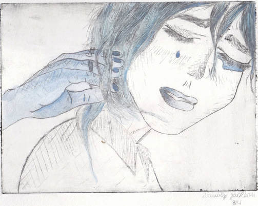
|
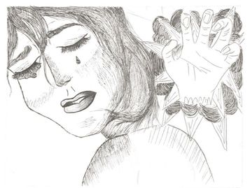
Title: Entangled
Size: 20 cm x 15 cm Medium: Dry Point Date: October 2017 Exhibition Text
Entangled is a dry point print that revolves around the concept of mental instability and stress, in addition to self debilitation. Heavily relying on movement from the face of the distraught young woman to the hand tangled in her hair, the hand and the hair act as a symbol of the intrusive entanglement of thoughts and worries in one’s life. The piece also incorporates cross-hatching (most notably in the hand and facial features) to add emphasis to the disheveled appearance of the woman. |
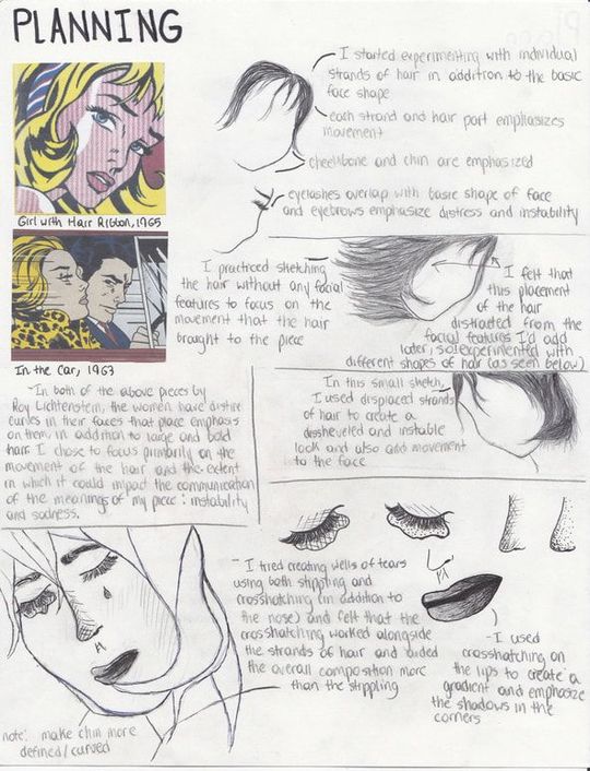
Planning
Inspiration
I’ve always been drawn to the pop art movement due to its vibrancy and boldness, and with the freedom given to me to explore my own artistic style through the dry point, I turned towards this movement Roy Lichtenstein’s pieces specifically.
Pop art first emerged in Great Britain in the mid-1950s and spread to the United States post-World War II. Known for its bold lines, bright colors, and portrayal of modern consumerism and products, the movement is often recognized for its acknowledgement of the effects of consumerism on modern culture. Pieces in the movement heavily revolved around the use of irony; seemingly stressful and dark situations were masked with overwhelming bright and vibrant colors and clothing, and consumer products were often glorified and put on blast through repetition of the same image that incorporated rhythm and balance.
|
(click to expand images and view captions)
|
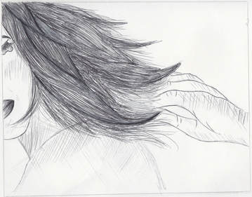
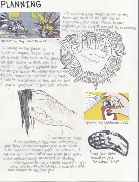
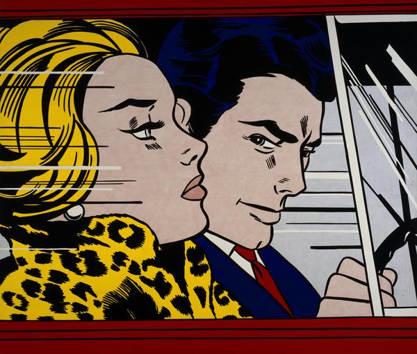
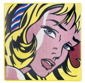
Roy Lichtenstein pieces primarily focused on human subjects that exemplified movement and the use bold/solid colors. Lichtenstein’s work, such as In the Car and Girl with Hair Ribbon, place emphasis on the bright yellow hair of the women and use bold, organic lines to incorporate movement. Since I was working with dry point as a medium and precise, sharp carving tools, I felt that placing emphasis on the hair using thin lines and strands of hair rather than bold lines would work best for this specific medium, but I still wanted to focus on the size and emphasis of this feature. Additionally, I took note of the placement of the face, in addition to the facial features of each of Lichtenstein’s pieces. In Girl with Hair Ribbon especially, the eyebrows and facial lines indicate signs of distress, balance out the face, and emphasize the sense of discomfort and instability in the piece. I wanted my piece to incorporate aspects such as this, and I also considered using the jagged shapes surrounding bold phrases and lettering in some of Lichtenstein’s pieces such as in Whaam!
|
|
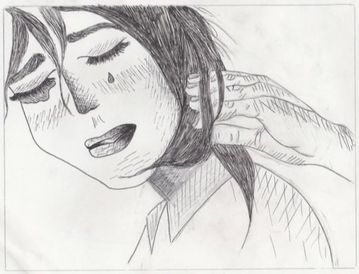
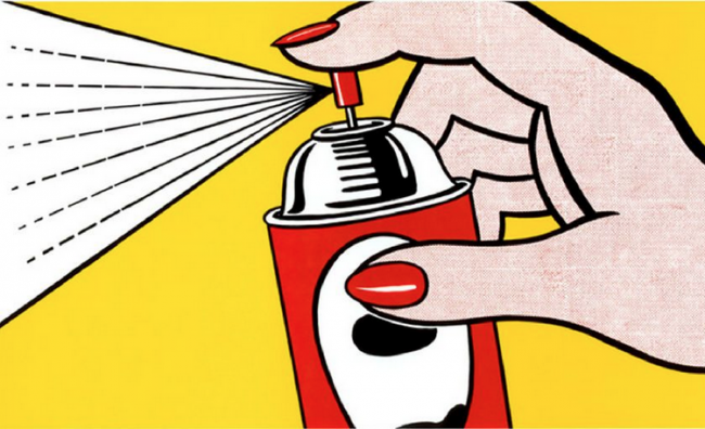
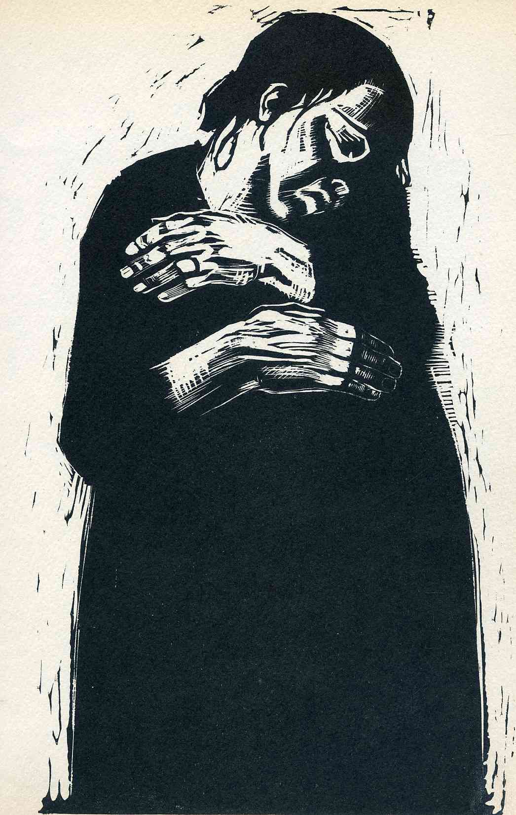
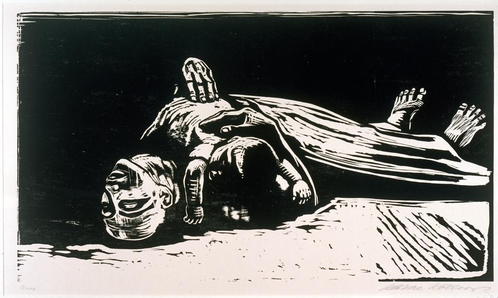
In order to incorporate a hand that evoked senses of discomfort and instability in my piece, I not only analyzed Roy Lichtenstein’s piece Spray (1962), but crosshatching techniques prevalent in Käthe Kollwitz’s post World War I German Expressionism woodcuts. I wanted to use a combination of both the movement present in the outstretched hand holding the spray can in Lichtenstein’s piece in addition to the intricacy of the organic lines of the hands in Kollwitz’s to take advantage of the precise carving tool I was provided with.
German Expression revolved emerged around World War I in Germany and communicated senses of menace, fear, and discomfort. Käthe Kollwitz’s work was a direct response to the violence and hopelessness associated with the deaths of World War I, and her pieces communicated this through jagged lines and organic shapes that formed images of sorrowful individuals. I specifically examined Kollwitz’s crosshatching in the hands, fingers, and wrists of her woodcuts to have a visual example of how I would incorporate shadows in the hand through contrasting values. |
  (click to expand images and view captions)
|