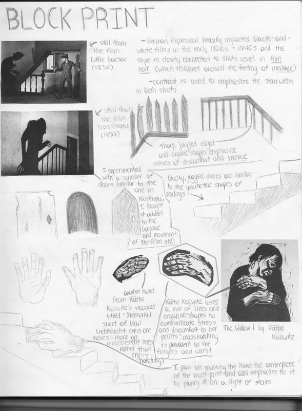
BLOCK PRINT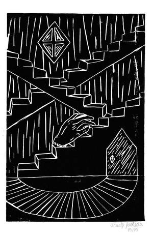
|
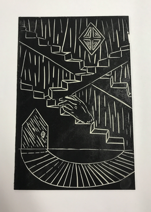
Title: Ascend Size: 23 cm x 15 cm Medium: Linoleum Print Date: September 2017 Exhibition Text
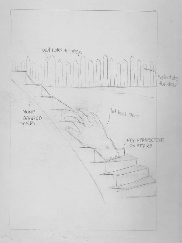
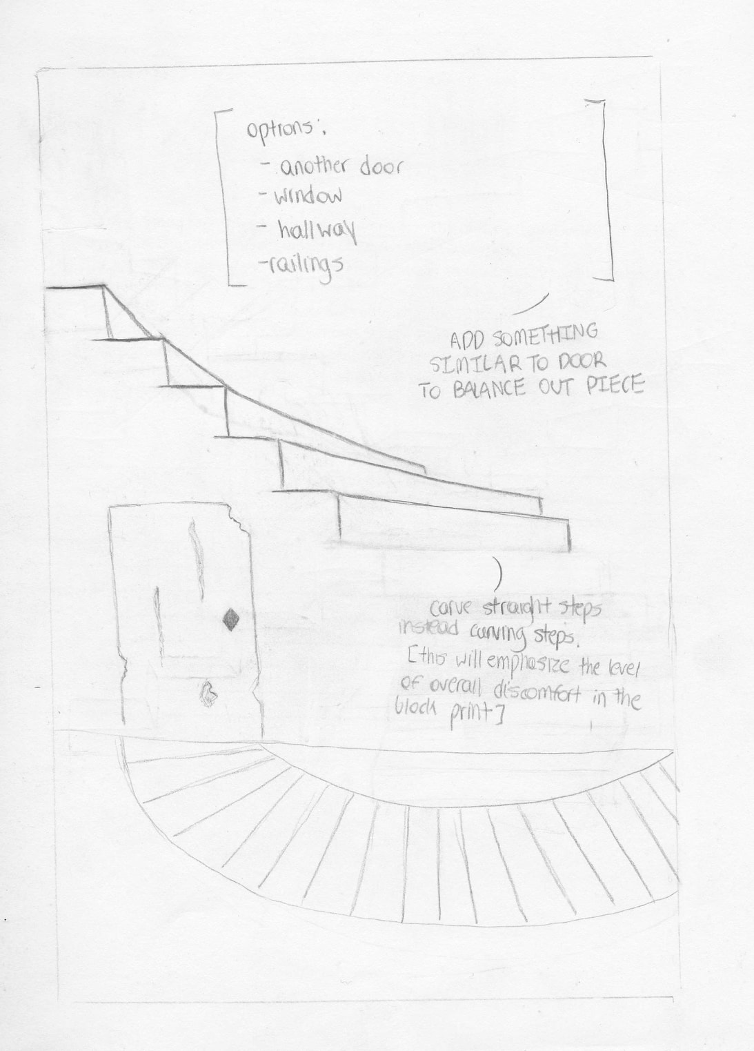
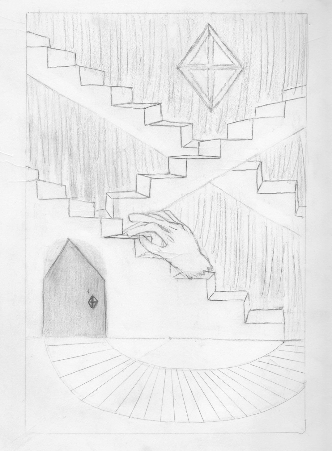
Ascend is a block print that revolves around emotional instability that comes with achieving a personal goal. Inspired by German Expressions - most notably in the form of film noir and 1920s horror films - the piece relies on contrasting, jagged visuals to add a sense of unfamiliarity and eeriness to the overall composition. The steps symbolize the confusion that is associated with goals, while the jagged hand is a representation of the struggling process to climb the steps to reach them. |
Meaning
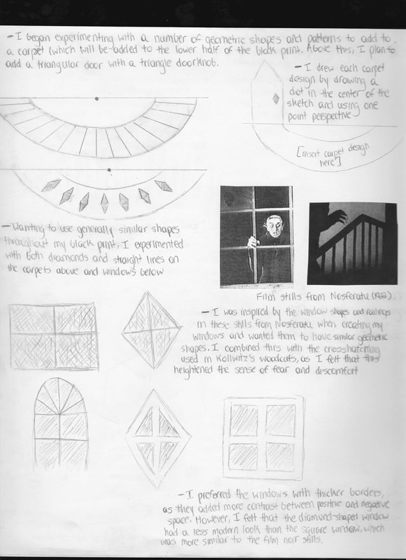
Similar to the fear and discomfort communicated in film noir and Kӓthe Kollwitz’s German Expressionism woodcuts, I wanted my block print to represent the emotional instability that comes with leaving one’s comfort zone and setting out to reach a goal. The bottom of the piece communicates comfort and stability, while the flights of stairs moving in different directions are meant to show the confusion and fear that comes with the process of goal-reaching. The jagged hand is a representation of an individual climbing towards their goal, but feeling overwhelmed with the components and paths that they must take (the stairs). At the top of my print is a diamond-shaped window similar to the doorknob on the door; this was intentional, as the window also is a representation of comfort that comes with finally reaching one’s goal and reaching a state of nirvana.
Critical InvestigationInspiration
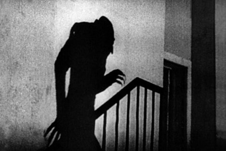
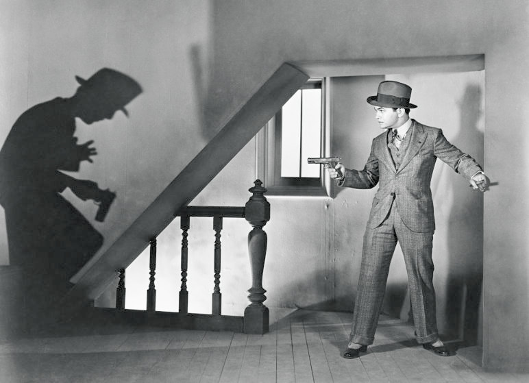
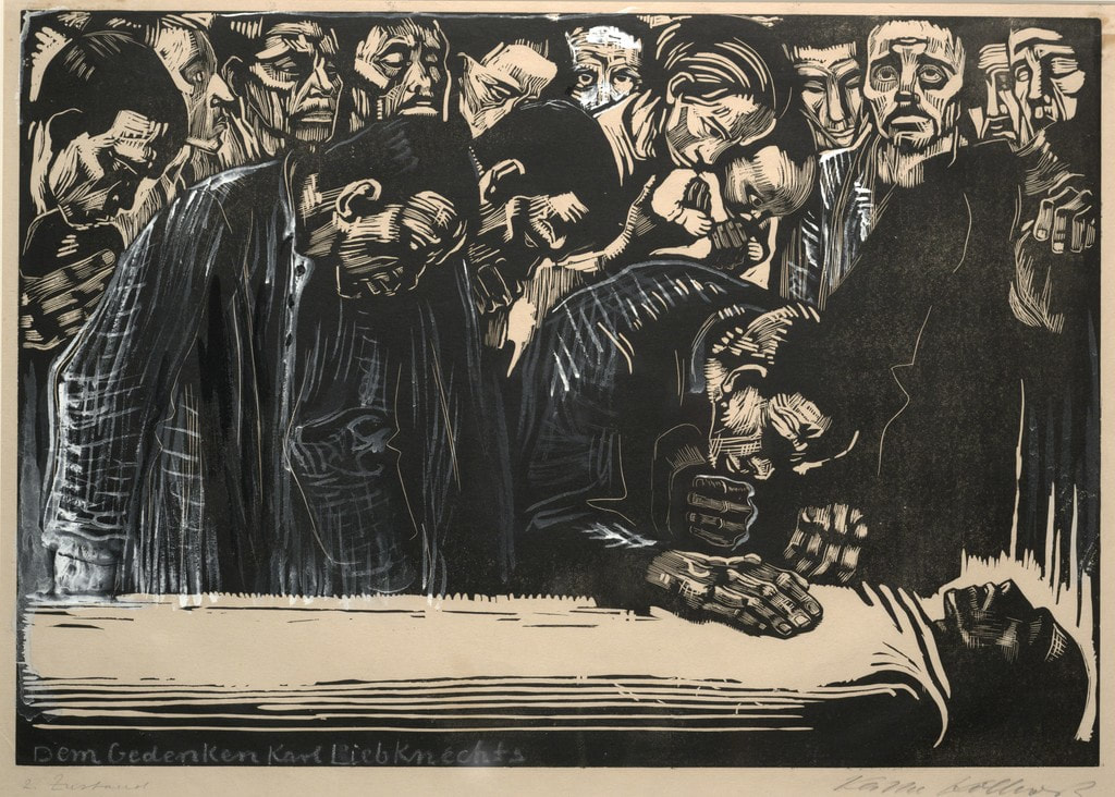
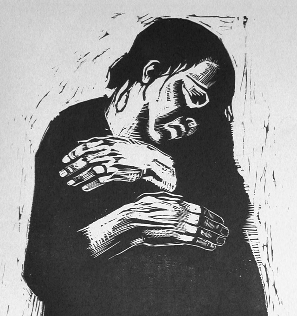
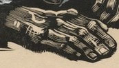
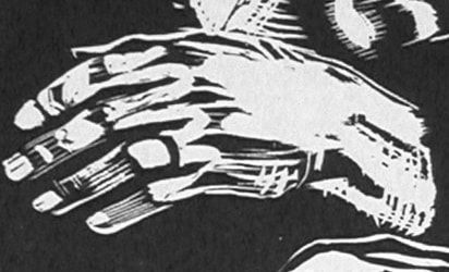
Having done prior work with German Expression in the form of scratchboard, I was aware that the movement arose in Berlin prior to the start of World War I and remained popular even as the war continued. Because of this, art mediums in this movement often convey senses of fear, discomfort, and/or menace. I wanted to explore the movement in different forms rather than merely scratch board, which lead me to the discovery of stills from 1920s-1940s detective and horror films. Film stills such as those shown in the top right (from Little Caesar and Nosferatu, respectively) heavily rely on the use of contrast and shadows to communicate senses of eeriness and discomfort. I was particularly intrigued by the portrayal and emphasis on the shadows in these stills; both communicate this element through their uses of contrast, which balance out the shadows and figures in the stills. I wanted to incorporate something similar in my block print, and began toying with the idea of centering it around a jagged, large hand in the center crawling up multiple flights of stairs situated in various directions. Film noir and German Expressionism in the form of films both center around feelings of menace and fear, and in order to communicate the sense of discomfort and emotional instability that comes with achieving a personal goal, I felt that stairs and doorways - along with the contrast that comes with block prints and ink - would heighten these feelings in whoever views it. In addition to film stills, I was also inspired by the crosshatching and use of organic lines in Kӓthe Kollwitz’s woodcuts and prints. In The Widow I, for example, is Kollwitz’s response to the fear, dread, and discomfort that was a result of the violence of World War I; it depicts a widow clutching herself with a sorrowful look plastered on her face. Kollwitz’s use of crosshatching is predominant in the hands and arms of the widow, giving her a more weathered-down appearance. Rather than carving the hands and arms realistically, she chose to take advantage of the contrast and method of woodcutting/carving to place emphasis on the widow’s emotional challenges. This is also a predominant feature in the hands of the man in the foreground of Memorial Sheet for Karl Liebknecht. I felt that incorporating a hand similar to this in the center of my block print would emphasize similar emotions. |
(click to expand images)
Up-close shots of the hands carved in Memorial Sheet of Karl Liebknecht and The Widow I by Kathe Kollwitz, respectively
|