NEGATIVE ILLUSTRATION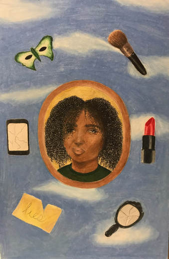
|
Title: Lies
Size: 38.1 cm x 25.5 cm Medium: Colored Pencil on Illustration Board Date: November 2017 Exhibition Text
Lies is a colored pencil illustration exploring frustration and discontent associated with the prevalence of European beauty standards and the inability for people of color to fully express their identity. Inspired by Surrealism and Rene Magritte’s piece Georgette, Lies incorporates a number of seemingly mundane items surrounding a portrait of a woman in order to symbolize and emphasize the imprint European beauty has on society through the use of a wide range of tones and a smooth texture. |
Planning
|
INSPIRATION
I wanted to experiment with using colored pencil to create a smooth and blended illustration, so I chose to research a number of Surrealist pieces for my inspiration, since they primarily revolve around a wide range of smooth and blended tones to create realistic figures and shapes. I felt that incorporating a figure or face in my illustration was essential to evoking emotion, and one of my primary goals was to communicate the discontent, frustration, and confusion that associated with the conformation of European beauty standards. Surrealism emerged in the 1920s and stemmed from a growing urge to reject rationality and upfront realism of subject matter; artists felt that the true imagination and depths of the mind could be conveyed through striking, out-of-the-ordinary shapes, figures, and objects and a wide range of tones and smooth textures, making Surrealism one of the most visually engaging and unique art movements of the 20th century. I chose to focus in on Rene Magritte’s pieces, since I personally found his usage of light, smooth backgrounds and foregrounds consisting of still figures to be unique from other Surrealist artists. His primary intention was to evoke mystery through his pieces, and did not often associate his works with any particular meanings, stating that "My painting is visible images which conceal nothing; they evoke mystery and, indeed, when one sees one of my pictures, one asks oneself this simple question, 'What does that mean?' It does not mean anything, because mystery means nothing, it is unknowable." The ambiguity revolving around his pieces allowed me to be more flexible when choosing one of his pieces as inspirations and connecting it to my theme of conformation and cultural instability; I ultimately chose to focus on his use of figures and faces to make this theme clear. |
The Empire of Light, a series of three oil canvas paintings by Rene Magritte, 1949-1954 (click to expand)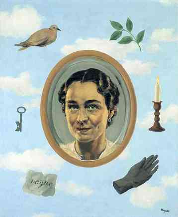
Georgette by Rene Magritte, 1937 |
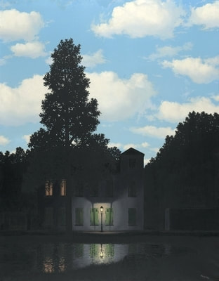
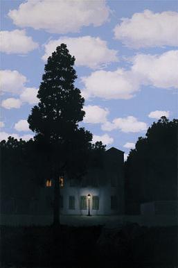
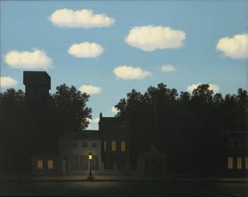
Many of Magritte’s pieces incorporated soft-textured and organic clouds in the background through his use of oil paints on canvas; The Empire of Light, a series of three oil on canvas pieces, is a notable example of the soft tones he uses in his backgrounds that add a sense of balance and unity to his pieces. The dim foreground contrasts the lighter tones of the daytime sky, placing emphasis on the smoothness of the clouds. I was particularly intrigued by the organic shapes and softness of these clouds, and felt that they would help convey the concept of artificial happiness and confidence associated with beauty conformation and cultural instability.
Magritte’s use of clouds to enhance texture can also be seen in his painting titled Georgette (1937), which depicts his a photograph of his wife in a picture frame surrounded by a number of enlarged objects. The year of its creation coincides with heightened marital issues between the two due to affairs; this major event, in addition the vague items associated with peace and beauty, led me to question the idea of physical and material beauty present in the piece. I chose to base my sketches and final piece around the placement of the objects and picture frame and the Magritte’s use of soft clouds, since I appreciated how the symmetry and balance aided the overall composition, and I felt that drawing physical objects would allow me to use them as symbols for the extreme implementation of Western beauty standards.
Magritte’s use of clouds to enhance texture can also be seen in his painting titled Georgette (1937), which depicts his a photograph of his wife in a picture frame surrounded by a number of enlarged objects. The year of its creation coincides with heightened marital issues between the two due to affairs; this major event, in addition the vague items associated with peace and beauty, led me to question the idea of physical and material beauty present in the piece. I chose to base my sketches and final piece around the placement of the objects and picture frame and the Magritte’s use of soft clouds, since I appreciated how the symmetry and balance aided the overall composition, and I felt that drawing physical objects would allow me to use them as symbols for the extreme implementation of Western beauty standards.
PLANNING SKETCHES
Planning Sketch #1
Planning Sketch #2
Planning Sketch #3
|
Note: in each of my planning sketches, I drew lines on the faces and objects represent the separation of tones, values, and shadows; this was particularly helpful to me when I began coloring my final illustration, since I was able to clearly see where to add darker and lighter tones.
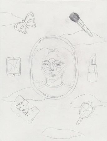
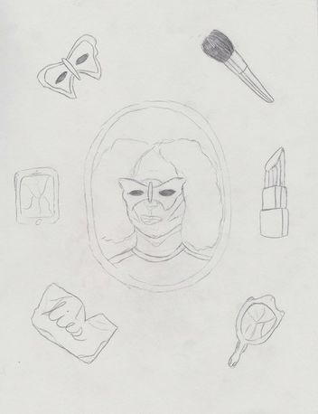
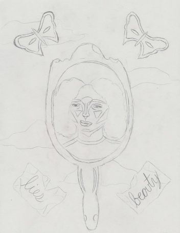
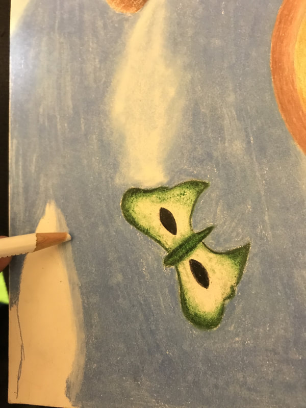
For my first and chosen planning sketch, I replaced the image of Magritte's wife in Georgette and sketched a framed photograph of a young woman with a discontent/angry expression upon her face to act a symbol for frustration towards heavily implied beauty standards and how they lead to cultural instability. In the background, I chose to add basic outlines where I wanted to draw clouds in my final piece; I added a number of lines to take note of where the face contours and shaded areas would be. I also chose to sketch six of the following objects around this handheld mirror: - Cracked phone (left): I wanted to communicate the power social media and internet usage has on spreading Western beauty standards, and how debilitating this can be for unique cultures and people of color. - Red lipstick (right) and makeup brush (top right): I chose to sketch these two makeup products to emphasize the idea of physical beauty and how it may lead to ignorance. - Butterfly mask (top left): I felt that the mysteriousness of a mask combined with the association of butterflies to the soul in many cultures and religions communicated closeted beauty and diversity among cultures besides the ones depicted the most in society. I also considered using the butterfly mask in my positive illustration in order to carry a clear connection between the two pieces. - Crumpled paper (bottom left): Similar to Magritte’s original piece, I chose to write “lies” on the paper to communicate the frustration people of color experience due to a heavy implementation of superficial Western beauty. - Cracked handheld mirror (bottom right): I felt that drawing a cracked mirror would successfully communicate obsessions with beauty and the negative effect it has on diversity and the growth of culture. For my second planning sketch, I kept the same objects surrounding the framed photograph in addition to the same woman, but chose to draw the butterfly mask on her face in order to symbolize the masked culture deeply rooted within personal experiences and ethnicity. Unlike my first sketch, I felt that this one evoked more mystery, but lacked the frustration depicted in the woman's facial expression. Since my positive illustration also depicted the same woman with a mask, I felt that I would be able to clearly show the connection between the woman in both and carry the concept of cultural and racial diversity between the two. For my third and final planning sketch, I considered replacing the picture frame in the Magritte’s original piece with a handheld mirror in order to communicate an obsession with physical beauty and how it related to a conformation to Western/European beauty standards. I felt that the handheld mirror better communicated this concept than the framed picture, but I ultimately chose not use this sketch because it distracted from the background, and I wanted to use the illustration as an opportunity to emulate Magritte's smooth and realistic clouds. Additionally, I replaced the range of objects surrounding this mirror with two butterflies masks on the top and two sheets of paper reading "lies" and "beauty" on the bottom. However, I felt that this prevented me from using objects to convey artificial beauty and the dominance of Western standards to a greater extent. |
|
PROCESS
1. Rather than sketching out my entire design on my illustration board before using colored pencils, I instead decided to begin only by drawing and coloring the face and frame, then working on the objects around out by tweaking them depending on how the face turned out. Since I had never used colored pencils to create such a detailed piece before, I was unsure if my blending techniques would work and allow me to achieve the smooth texture similar to oil paints that I had hoped for. The colors and sizes of my objects surrounding the frame completely depended on the final outcome of the tones and range of values used in the face and frame. In order to ensure the frame was in the center of the piece, I used a ruler to place a dot in the center of the illustration board, then sketched two symmetrical and ovular lines. |
|
 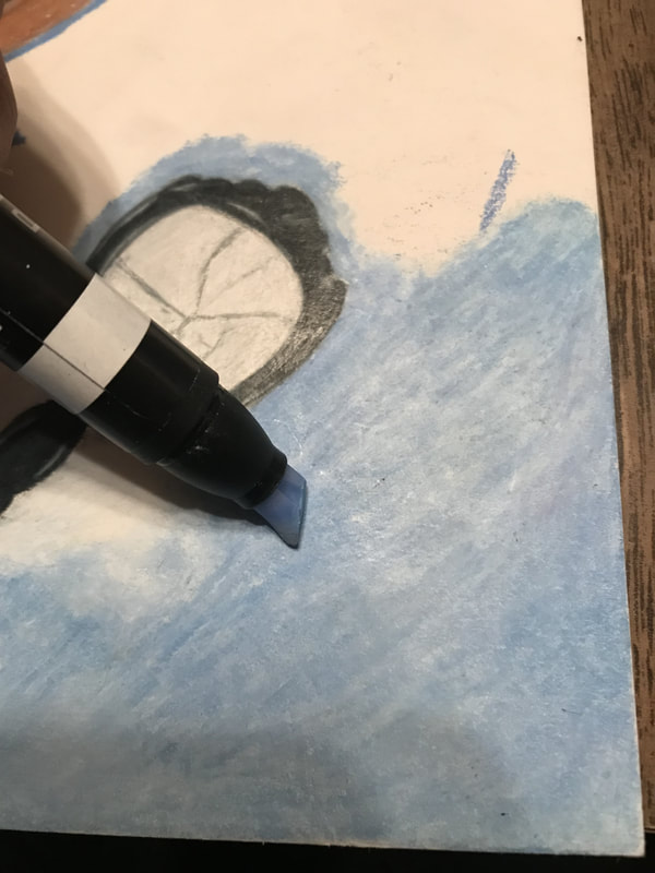 To form the clouds, I used a white colored pencil to smooth out the edges, then blended the cerulean blue and white with a large uncolored blending marker.
(click to expand images) |
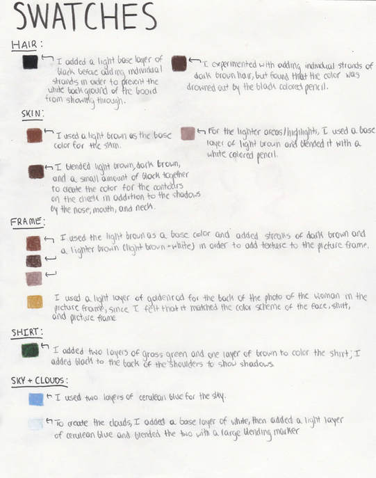
2. To begin, I added a base layer of colored pencil to the face and frame (light brown), and progressively added layers to this in order to emphasize shadows and highlights and give the piece a more realistic look. I realized that Magritte added texture to the frame in Georgette by adding streaks of dark brown and lighter brown/white to the sides, so I decided to do so also by outlining some areas with my white and dark brown colored pencils. I found that this gave the frame a more realistic look, which was a feature of Surrealist pieces I thought was important to emulate.
3. I drew the hair by coloring the general area I wanted to add strands to with a black colored pencil, then went over this with individual strands of hair drawn on using heavy pressure; I was seeking realistic texture and emphasis on the face of the woman, and I felt that drawing large amounts of hair on each side of the face would heighten this emphasis and also add balance and symmetry. I finished approximately 3/4 of the face and hair, then moved onto the sky and objects. |
4. I primarily used a colorless blending pencil/marker to blend the colors in each of the objects surrounding the frame, once again using base colors and layering over them with heavier layers. For the drawing of the lipstick, for example, I only colored in the areas without highlights, then spread the colors to the highlighted areas with the colorless blending pencil, which gave the lipstick a lighter tone in those areas. By doing so, I created smooth and solid objects that added both balance and a realist look to the piece.
5. I colored the background/sky/clouds by making small, general outlines of the clouds and coloring around these in blue; I then applied pressure and smooth out the sky using the colorless blending marker, removing any white/blank areas. When creating the clouds, I outlined the general area with white on top of blue, then blended blue and white together with a colorless blending marker to give the clouds a slightly transparent and soft appearance, similar to the seen in Magritte's backgrounds in his The Empire of Light series and Georgette. Although the clouds were organic shapes, I was still able to add symmetry to my piece by their placement against the objects in the foreground.
6. Lastly, I added the background of the frame and the shirt of the woman last in order to ensure that these colors would match with the colors of the objects surround it; I ultimately chose a green shirt to match the butterfly mask and a light yellow/goldrenrod background, since I wanted there to be unity and balance similar to that seen in Georgette, and I wanted this unity and balance to communicate Western beauty seen on the outside.
|
Experimentation
Although I had worked with colored pencils before, I had never used them to blend to the extent that I did for this particular illustration and specific drawing board. I initially experimented with layering multiple thin layers of a range of colors (i.e. dark brown, light brown, and yellow for the skin tone) and then blending it with a white colored pencil in order to give my illustration a less textured look. However, I found that using thin layers on this type of drawing board made it difficult to completely cover it, and the white of the drawing board still showed through, giving the face and objects surround the frame especially a less realistic look. I felt that a blended and realistic look was the key component to leaving traces of surrealism and Magritte’s style in my illustration, and this particular technique prevented me from achieving that. Regardless, I still used thin layers to lay out a framework for myself in order to remember what colors I needed in order to enhance the range of values of tones in my illustration. I then went over this framework using more pressure, and this created a solid look for my piece that was similar to oil paint. While experimenting with using a white colored pencil to blend the range of tones used in my piece (i.e. the light and dark brown in the face and the light blue and light purple in the sky), I soon realized that the white muted out my original tones and made them less bold. Although the background in Georgette was a pale blue tone, I chose to use a more bold blue tone in order to emulate the more vibrant tones found to match the more vibrant tones in my foreground. I was able to use a colorless blending marker for both the skin tones, objects, and the background, which allowed me to retain the original tones I had hoped for while simultaneously blending multiple layers quickly and easily. I also found that using the blending marker prevented any white spots from the illustration board from showing through my colored pencil drawings, giving my piece a more solid and complete composition. I experimented with going over the cerulean blue in the sky with another layer of white colored pencil, but found this process to be extremely time consuming and instead chose to experiment with the colorless blending marker to smooth out the sky. By doing so, I was also able to create clouds that appeared slightly transparent and spread out, similar to the clouds seen in Magritte's The Empire of Light series. |
Additionally, I also experimented with a range of motions when coloring my piece, such as a rapid back-and-forth motion with heavy pressure for my top layers of colors. I found that this particular method create prevented me from achieving the smooth texture and blended look I wanted to emulate from Magritte’s pieces, and it was clear that the white colored pencil was applied unevenly, since it created streaks in my darker base colors, such as the frame of the handheld mirror, highlights on the face, and strands of hair. However, I realized that using small, circular motions with the same amount of pressure helped significantly; rather than a rugged look, the illustration had a composition most similar to Magritte’s Georgette that left traces of surrealism’s balance and smooth texture.
Reflection
Overall, I'm very pleased with my final illustration and its overall composition. Since I had never used colored pencil when creating a larger scale illustration before, I was somewhat hesitant to complete this project. However, the creamy texture of the colored pencils, in addition to a colorless blending marker, allowed me to easily blend tones and create a solid piece. Although Magritte used oil on canvas in order to achieve smooth textures and a realistic look to the objects and facial features, I was still able to emulate this to some extent using a number of blending techniques (i.e. the blending marker or a white colored pencil or base color); shading is present in the face and skin tones, in addition to the highlights on the objects (i.e. the glare on the handheld mirror frame, in addition to the lipstick and makeup brush). My final illustration closely emulated Magritte's Georgette, and the ambiguity surrounding his pieces allowed me to add my own twist and theme to my final piece. The symmetry and balance seen in Georgette, in addition to the majority of Magritte's other pieces, still remained intact through my depiction of the framed photograph and angled objects surrounding it. The range of large objects surrounding the frame allowed me to communicate stereotypical beauty and aspects of society that heighten Western beauty standards.
I also found that I was able to connect the theme from my positive illustration (the release and progression of racial and cultural diversity) to the theme of my negative illustration (the dominance of Western beauty standards and the oppression of cultures) by incorporating green butterflies in both . However, if I were to revisit this project in the future, I'd most likely redo the background in order to lighten the tone of the sky. I was originally aiming for a paler tone for the sky in order to make the clouds look more realistic and not hold too much contrast against the sky itself, but I found that coloring the background with a heavy base color and going over the base with a white colored pencil, then blending this with a colorless blending marker was extremely time consuming, and I ultimately chose to use only one color. I felt, however, that this darker blue did add balance between the background and vibrant colors of the skin and objects of the foreground. Additionally, I felt that ultimately choosing the less time consuming method resulted in a rushed appearance in the background, since the colored pencil streaks are noticeable, and I feel that if I had taken the time to use more intentional pencil movements (i.e. circular and repetitive movements) it would lead to a smoother texture and appearance.
ACT RESPONSES
1) Clearly explain how you are able to identify the cause-effect relationship between your inspiration and its effect upon your artwork.
Magritte’s pieces evokes mystery and thought using realistic shading and smooth tones, and I was able to use this to my advantage when working with colored pencil that imitated this smoothness. I was able to connect his pieces to my theme of cultural instability and Western beauty standards due to their representations of inner emotions through faces and objects.
2) What is the overall approach (point of view) the author (from your research) has regarding the topic of your inspiration?
Rather than creating pieces with heavy meaning, Magritte used surrealism to allow the viewer to question his works; he took an alternative approach that combatted the artistic norm by seemingly outlandish paintings.
3) What kind of generalizations and conclusions have you discovered about people, ideas, cultures, etc. while you researched your inspiration?
Surrealism was a challenge to the artistic norm, and artists such as Magritte defied these standards by creating realistic yet strange figures and shapes. During the mid 1900s, pieces such as these expressed vague and mysterious meanings.
4) What was the central theme or idea around your inspirational research?
Magritte’s pieces had no deep meaning, but instead encouraged thought from the viewer through depictions of strange and outlandish figures and smooth tones. He encouraged this through
5) What kind of inferences (conclusions based on your evidence and reasoning) did you make while reading your research?
Artists will often use twists of artistic norms, such as tones, values, and shading, to reject conventional artistic standards and evoke a sense mystery for those viewing their pieces.
SOURCES
Magritte, R. (2017). Empire of Light. Retrieved December 5, 2017, from https://www.guggenheim.org/artwork/2594
MusIcon™: “The Empire of Light”. (n.d.). Retrieved December 5, 2017, from http://kranidiotis.gr/musicon-the-empire-of-light/
Magritte, R. (n.d.). René Magritte. The Empire of Light, II. 1950 | MoMA. Retrieved December 5, 2017, from https://www.moma.org/collection/works/78456
Magritte, R. (n.d.). Georgette, 1937 - Rene Magritte. Retrieved December 5, 2017, from https://www.wikiart.org/en/rene-magritte/georgette-1937
Rene Magritte Biography, Art, and Analysis of Works. (n.d.). Retrieved December 5, 2017, from http://www.theartstory.org/artist-magritte-rene.htm
Rene Magritte and his paintings. (n.d.). Retrieved December 5, 2017, from https://www.renemagritte.org/
